winvid – A slim YouTube to WMV converter
Posted in Other Projects March 18th, 2021 by dotcomboom

A couple days ago I hacked together winvid, a site that lets you download YouTube videos as 144p or 240p wmvs that you can play on Windows Mobile phones or other suitably older equipment.

The backend is a very simple Flask application that runs youtube-dl for downloading the video, and then ffmpeg to convert it into two qualities of WMV. First, it converts the downloaded mp4 into the 240p version, and then that is sampled down to an additional 144p mono version. This is done to save processing time, as the conversion from mp4 to wmv is actually the longest part of the process. Longer videos, naturally, will take a longer time to convert than shorter ones. Just hold on the line a few minutes. Once it’s done, it refreshes the index which lists out all the videos cached.

Regrettably, the site itself will not work on mobile IE due to Replit’s new encryption practices—yet another victim of the ever-spreading “HTTPS-first” philosophy. It will still work on RetroZilla and Opera Mini 5.1 however, so old PCs and pocket devices can still download to their hearts’ content, at least for now.

On mobile, remember that data charges may apply if you’re not downloading over Wi-Fi. If you’re on a prepaid plan like I am, you may find it beneficial to transfer the videos through Bluetooth/microSD/USB, what have you. I have gotten it down to about 2mb per minute for the 144p mono version so it’s just about as efficient as it could be on data, though results will still vary.

As well as Windows Mobile and Pocket PCs, I’m confident that this would be very useful for less equipped, retro processors as well–think your Pentium II-era, and potentially your XP-era machines. People throw 1080p video at these things and when they start skipping frames, deem them useless. In reality, 240p and even 144p are still quite watchable for a lot of videos so long as you aren’t narrowed into the details. I’m looking forward to trying it out under RetroZilla and WMP on some bare metal when I get the time.

It’s a small and niche pet project, but also pretty hackable and adaptable. If you’re the type, I encourage you to fork it, make changes to it, that good stuff. I’ll note that this definitely can be run over a local network as well with a bit of setup. I’ve found it useful, and hope it is for you too.

Color spaces are weird.
Posted in Software February 21st, 2021 by dotcomboom

A couple of years ago, I came to notice something that perplexed me.

Under Blink/Chromium-based browsers and Electron-based applications, colors just did not look the same. My laptops, namely, a ThinkPad X220 and X230T, and my mid-2012 MacBook Pro–likely among other devices with Intel HD Graphics–would always give colors a strange saturation boost within the browser. Images wouldn’t look as they appeared in painting programs, and the default blue links would look more purpleish.

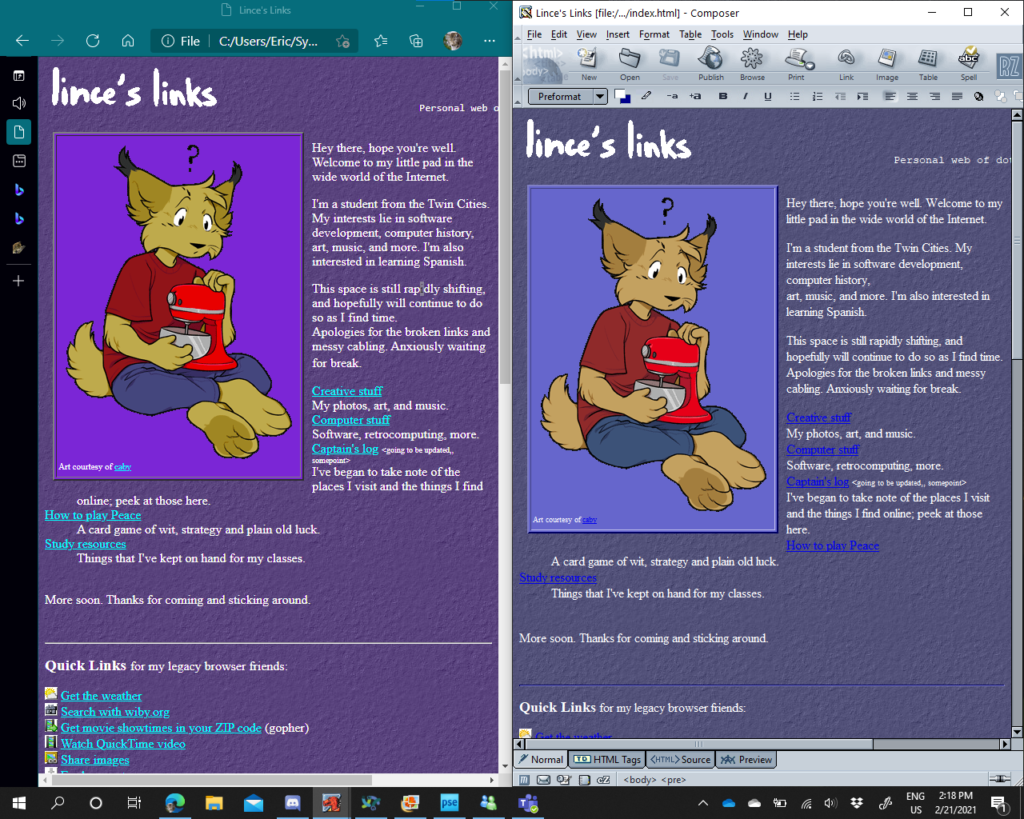
As I’ve been working again on my new personal site, this came to my attention once more. I use Edge as my primary browser, and have been using RetroZilla Composer and SharePoint Designer interchangeably for editing. Let me show you the same page in both stock Microsoft Edge (Chromium) and RetroZilla. Notice how on the left, the page has more saturation than on the right?

(Author’s note, this is through a VGA external monitor. However, the effect is the same on the internal LCD.)
(Ignore the link colors being #0000FF on the right, which seems like a Composer-specific quirk.)

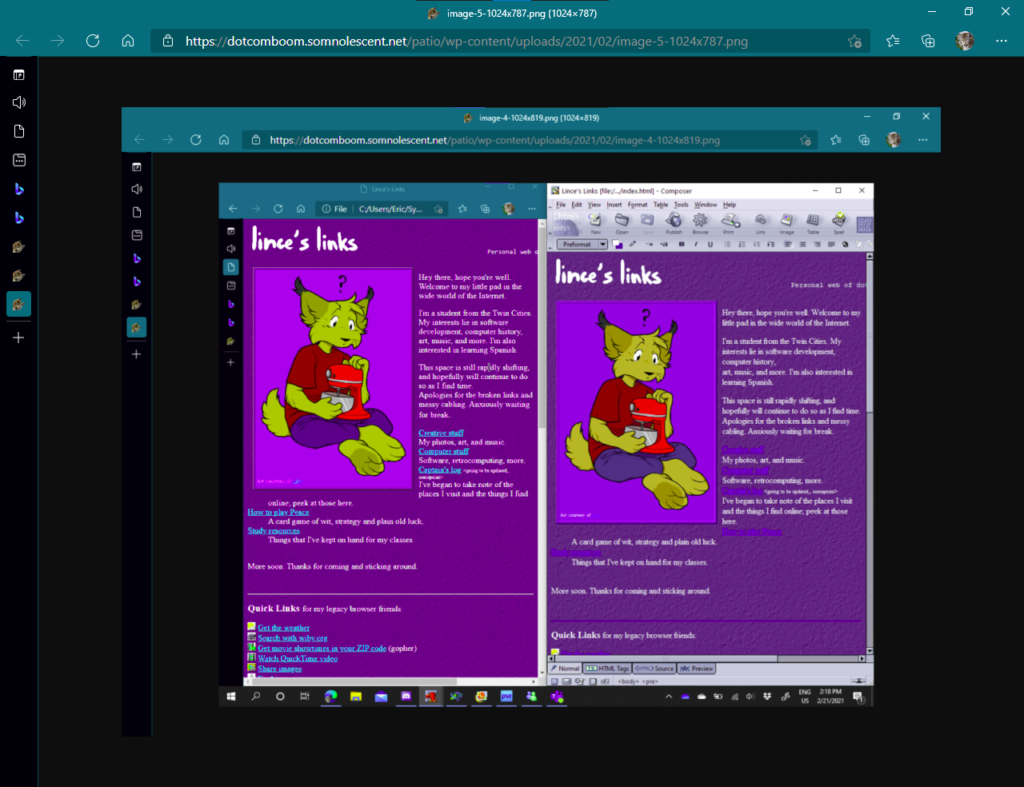
If not, then let me give it another pass or two:

Now Lince is becoming almost an alien, poor lad:

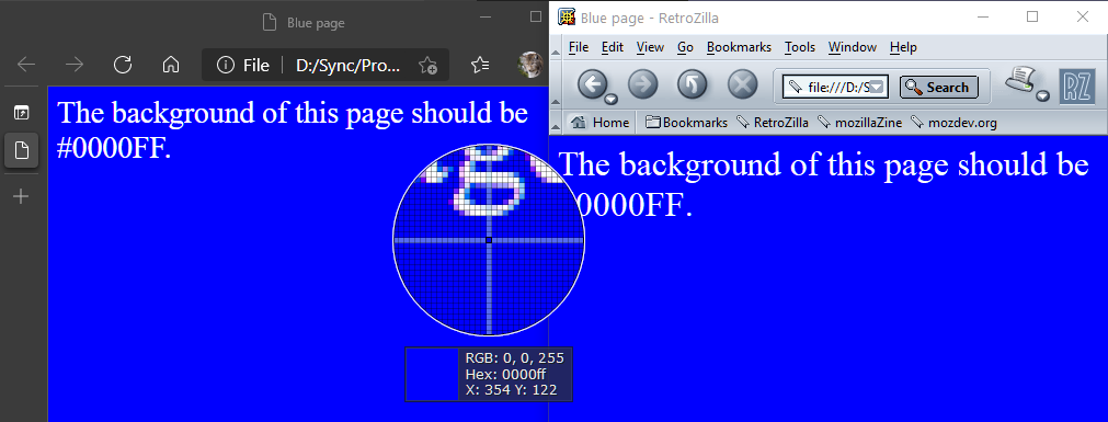
Peculiar, huh? It is also across the whole window, including UI elements. To better illustrate, I saved a page with a #0000FF background and used a color picker to check. Under Edge, it’s displayed as #6700FF, while under IE it is #0000FF as expected. You can test this for yourself as well.

Comparison between stock Edge settings and Internet Explorer. Edge displays the page’s background color as #6700FF.
Internet Explorer displaying the background as #0000FF.

I tested Chrome and Vivaldi with the same results. Though, I tested Firefox, and the color was as it should be. I could’ve sworn the same has happened within that as well, but testing it again seems to prove otherwise. I’ll give Mozilla credit where its due.

Internet Explorer and Firefox, both rendering the background as #0000FF.

Where things really get bizarre, however, is how on my parents’ desktop with Intel UHD Graphics 630 (a later generation chip), and my desktop with Nvidia graphics as pictured below, the color is displayed as expected under Edge. No flags have been changed for this screenshot.

Edge passing the #0000FF test on my desktop!

My theory is that Chromium and its descendants respond to the Intel HD Graphics chips’ color profile in some way– either the chip, or possibly some monitor calibration settings from the laptops’ manufacturers. As to why they make this distinction, exactly, I don’t know.

Fortunately, there is a remedy in chrome://flags (or edge://flags, vivaldi://flags, whichever equivalent). I am not aware of a way to apply this tweak through Electron apps which lock that out, but there is a flag to “Force color profile”. Choosing sRGB, the standard color space formulated by Microsoft and HP many moons ago, will make the colors display correctly again.

If anyone knows why this happens, or has had anything similar happen to them, let me know. It’s one of those things I never hear about but still makes me wonder. Additionally, why did we move off of a sRGB default for the Web anyway if it causes these kinds of discrepancies? Shouldn’t HTML colors be rendered just as they are in the markup or stylesheet? And does anyone other than me really even notice?

Tomate, a Pomodoro timer for your Windows Mobile
Posted in Other Projects, Software November 22nd, 2020 by dotcomboom

So, a few days ago I had an idea knocking around to make a Pomodoro timer. I’ve used Pomofocus every now and again but wanted to take a spin at it myself in VB. I was thinking of having it as a desktop application but then thought it’d be more fun to write it as my first proper Compact Framework application. I jotted a mockup down before going to bed, and got to implementing it today.

One thing I really like about Compact Framework development is its close similarities to Winforms. You get a designer (with the option to have a skin for any targeted screen size) and a subset of the controls you’re already familiar with. After about an hour and I had my first minimum viable product, something that could run within an emulator and on my phone. I even found out how to make those CAB installers.

This was the MVP, I’d say. 11:48 A.M., too. I spent much longer polishing it up and getting the beep to work.

Remember how I said that mobile development was really similar to Winforms? Well, that also means Compact Framework executables are more than happy to run under desktop Windows. (So long as you aren’t using any fancy device APIs, of course.)

This was pretty sweet–or, ripe.

A chunk of my time was then spent scratching my head and reading StackOverflow at how to implement playing sounds from the project’s Resources; I ended up giving up on that front, but was able to play the \Windows\Standard.wav sound and just do a system beep if that was not available (Desktop). Couldn’t have the pleasant sounds from Pomofocus unfortunately, rather a smidge loud beep sound. Perhaps later down the line.

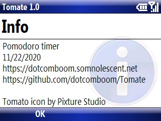
Here’s the final version. I had polished up the UI by adding the arrow indicators on both sides of the screen when the timer is stopped, and replacing the mainMenu control with my own Start/Stop indicator label. All of these have Click events so they’ll work on desktop and Pocket PC. On desktop you can also start with Enter and switch modes with the keyboard using the same key codes internally as Windows Mobile. Convenient!

As I was making a release on GitHub, I found out I could actually target older platforms all the way back to Pocket PC 2003 (a touchscreen platform) without losing support for Windows Mobile 6.1 Standard (a non-touchscreen platform). I had thought that it would refuse to run, but it just worked. That was really cool to see.

I’m very happy with what I got done in the end. One more crossed off my idea list, and something I can really see myself using.

Oh right! You can find Tomate on my site or GitHub. Send feedback and help out if you wish. The CAB’s for installation on mobile devices, and the exe file will work on desktop. Check the readme if you need prerequisites.

(Sidenote: I’m not sure why Visual Studio packages with the CAB extension, uppercase. Alas, possibly one of those fabled Microsoft mysteries we’ll never solve.)

Bryce
Posted in Software November 7th, 2020 by dotcomboom

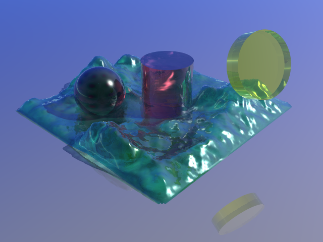
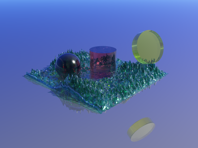
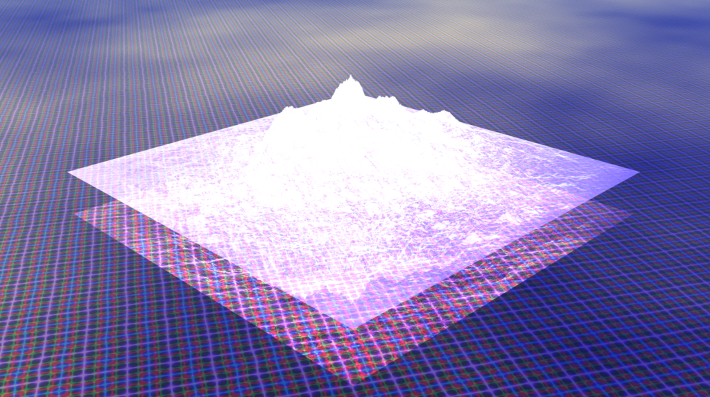
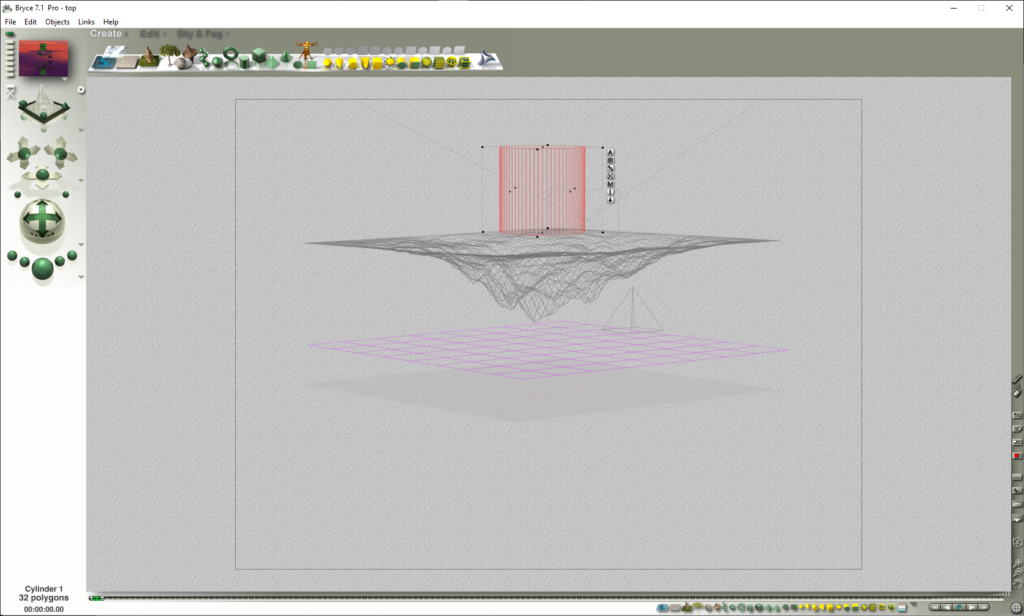
From the comments section of a 1996 drum and bass mix YouTube put in my recommendations (which I’ve been enjoying very much, going into the weekend!), I discovered Bryce: a fractal terrain generator, modeling program, and lost art.

Surprisingly, there still remains an active community for this piece of software and you can still purchase Bryce 7 Pro from Daz 3D, with the same iconic interface and rendering style. Top row of the gallery above was rendered in Bryce 2, and the bottom row in Bryce 7.

Precipitous Rocks, some Bryce work from the incredible Horo. Check out his web galleries and panoramas.

I love the look of Bryce’s output. It’s so.. vibrant and wistful, and yet has this pinch of digital surrealism you can’t quite pinpoint. It’s like a dream where you can’t quite figure out what’s happening, but want to see what happens next. In the age where photorealistic computer graphics are ubiquitous, it’s refreshing, and oddly soothing. And just perhaps, it’s the old drum and bass to the clean-cut EDM of today.

Mmm. Makes me want to make album covers.

Encarta!
Posted in Software October 23rd, 2020 by dotcomboom

Having to do some research for school and bored of just using the internet, I installed Encarta 99 earlier. It’s always been something of niche interest to me and I’d be more than happy to have some helpful information stored for when I need to work offline; on top of that, it’s just a plain neat piece of kit altogether.

While Encarta has sadly long bit the dust from the likes of Wikipedia and other internet resources (its last release was in 2009) leaving as but a faint memory, I can tell how exciting it must have been- and, arguably, still could be- to have a full interactive encyclopedia right on your hard drive.

Throughout the 90s, multimedia sold PCs. Interactive CD-ROMs popped up left on many subjects and niches. Microsoft Home had plenty of them, some of which I have in my posession, including the ever-so enlightening Julia Child’s Home Cooking with Master Chefs.

See the source image

Encarta was the flagship of this era. Put away your Encyclopædia Britannicas and tap into a wealth of knowledge within seconds, with not only articles and images presented in dazzling hypertext but also maps, panoramas, presentations, tables, charts, a dictionary, web links, and updates for a whole year.

The update servers are sadly long gone, and I’m not sure if the updates have been archived.

It was a breakthrough. So much content, delivered in a way that’s accessible and fun to explore. I really like the presentation of the articles and different topics in Encarta 99: it’s got that neat late 90s Microsoft aesthetic to it, which I’d totally use in a site sometime. It also appears that the Chicago font (of Classic Mac fame) was used quite a bit as well for small type, amusingly. Good choice, all things considered.

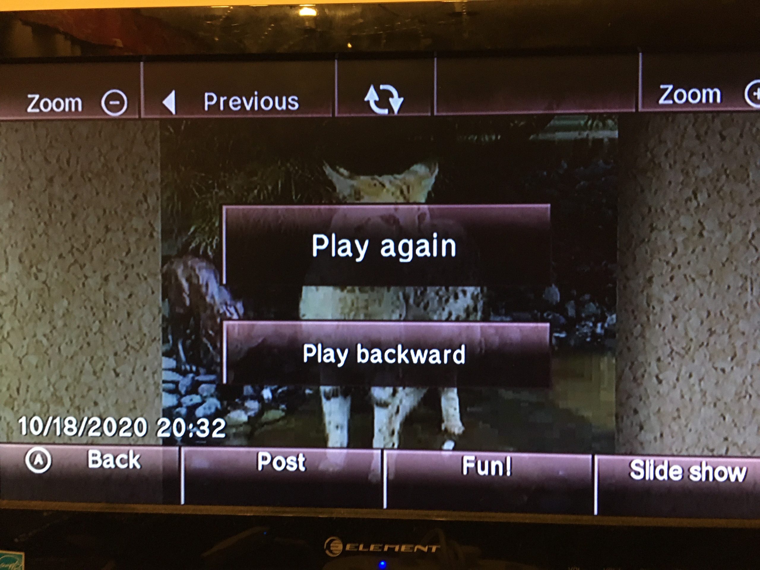
A bobcat.

I’d still happily recommend trying out an old copy of Encarta one time or another in the same way one might keep around an old encyclopedia from yesteryear– just make sure you have Shockwave Player 8 installed first if you’re on modern Windows. A lot of the information is out of date, but when you’re looking in historical contexts or general subjects, it can be fun and useful. You might even learn something new just jumping around the navigation.

Converting video for the Wii’s Photo Channel
Posted in Software October 19th, 2020 by dotcomboom

Wii Video 9 (nice title) didn’t want to work for me, so here’s a better way with ffmpeg:

ffmpeg -i "gatogrande.mp4" -vf scale=-1:480 -c:v mjpeg gatogrande.avi

Videos don’t have sound, not sure which one I need to use, as it seems the default AAC codec ffmpeg uses does not work. Might update this post if I find out.

In any case, I’m happy to have finally got this elusive (to me anyway) feature to work: even the puzzle game works, and you can post frames to the Message Board and Wii Menu banner. The Photo Channel’s a lovely piece of kit, really. Good memories with it.

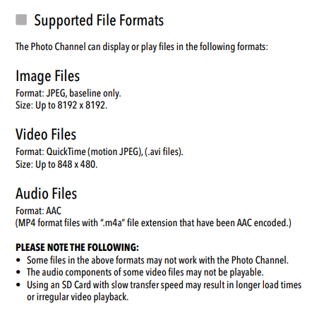
From the Wii’s manual. Apparently mjpeg .movs are supported. And ooh, .m4a audio support– glanced over that completely. 1.1 removed .mp3 support though too? For some reason? Legality? Nintendo says it’s because of quality, but why they removed the option is beyond me.
Spring 2019 drafts: Palm, Gopher
Posted in Software August 10th, 2020 by dotcomboom

Sometimes during long class sessions (look, I can’t help it-) I write stuff down and map projects out on paper. I found a couple of these from Spring 2019 (honestly a really long time now, gee) while cleaning my space around, so I’ve decided to copy them down to post here.


What’s on my Palm (2019 edition)

Here are some applications I use on my Palm Tungsten E.

Memo Calc

This serves decently as a basic scientific calculator. You can set variables as well, and it will save these to your Memo Pad.

Sega Swirl Lite

Fun puzzle game. The demo only has two levels and it doesn’t appear that the full version has been surfaced recently. Also available on PC and Dreamcast, with the latter version featuring Comic Sans MS and a snek. That’s clearly the definitive version, but this suffices.

Documents to Go

This was preloaded on a bunch of devices in the era. It brings Word, Excel, PowerPoint and an image viewer to this model. It requires some 3rd party software to HotSync, but it’s alright and the image viewing alone makes it worth it, since this model runs OS 4, which doesn’t have a native gallery feature.

SimCity

It’s the original SimCity but portable. The touchscreen usage is eh, but overall good. Features sounds and a decent interface nonetheless.

ZLauncher

This completely replaces the built-in Palm OS launcher and I’d say it does an excellent job at it. Themes, dragging and dropping to perform certain actions, and tabs make this a versatile replacement. A must.

A Word on AvantGo

AvantGo was slick. It could update certain “channels” every time you ran a HotSync and make them available offline. For a time, this way the best way to access internet content on your PDA. Unfortunately, however, the service closed, the enterprise server software hasn’t surfaced, and we don’t have a good idea how the service worked internally, meaning that unless something comes up, a replacement service is not likely. In the meantime, there is iSilo, but that is a commercial product and not all sites work with its companion application, iSilo X.


What is Gopher?

Editor’s note: A little bit here later made its way to my Gopher is Not the Web post in June 2019. The following’s pretty scattered, as most of my jotdowns are.

Gopher is an internet protocol, like HTTP (which serves as the backbone of the Web) and FTP. Gopher is not the Web, and is not indexed by Web search engines. And the Web is not equal to the internet; it instead builds on it with its own protocol, like Gopher, FTP, IRC etc. do. To fill the gap of searching the many Gopher servers available, there are search engines available for it.

Gopher should not be considered a lesser HTTP or Web, but more like an improved FTP. It offers a quick and easy way to find and retrieve resources on the internet.

Each Gopher server is made up of several menus with “selectors”, that link either to other menus or files. At the minimum, a Gopher menu is a list of files and folders. However, Gopher menus are flexible: a selector can have display text separate from where the selector links to, and they were designed in a forward-compatible way. Since the original standard, information text, URL links, and more file types have been implemented into clients. The result is a very easy to navigate interface.

Gopher’s forward-compatible nature means that any well-formed Gopher menu should display more or less correctly on any client, regardless of age. For example, when Gopher+ was proposed as a specification, it did not have to rework how menus behaved, instead only taking advantage of an extra field in selectors signifying support that would have been ignored in non-Gopher+ enabled clients. More recently, URL links have both client-side and server-side implementations for old clients. And information selectors, when rendered by a client that doesn’t support them display as a file that could at worst lead to a fake domain name when clicked on. Gopher can be used on the oldest of PCs (Macintosh System 6 and Windows 3.1 included!) without difficulty.

Gopher, from the beginning, has supported sending a search request to servers by means of the “7” item type. Just choosing a selector of this type will pull up a search dialog in your client. After typing it in, the client will send it along with the resource path to the server. While this is meant for searching servers, it also has been (ab)used in various ways: creation of ASCII text art through a Figlet gateway, link shortening, and even a playable version of Zork.

There is a wealth of information on Gopher: personal burrows and sites, software, articles, weather, full books from Project Gutenburg, and not to mention multimedia: audio, video, and images. Gopher is no means limited by age from delivering any type of file.

AutoSite Devlog #7: Work Continues
Posted in AutoSite July 30th, 2020 by dotcomboom

It’s been forever! The last devlog was all the way back in early April, before I quietly released RC3 in May. Since then AutoSite’s stayed mostly put while I’ve tried out other things. That said I’ve got kicked back into my stride and work goes on.

Quick Insert

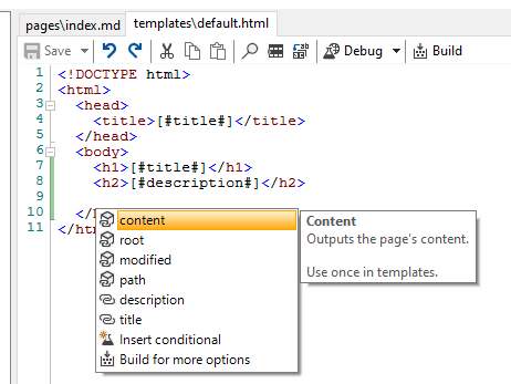
A brand new menu has been added that can be brought up with Control+Space or Control+J that gives you a quick list of attributes you can reference and define.

Tidying and streamlining

Some dialogs and message boxes are being revised somewhat to be (I’m hoping) clearer. These include the phrasing in the message box that comes up for a Sanitary Build and the Insert Conditional dialog.

Old
Old
New
New

New conditional help text has been brought to the Quick Insert menu, making the old dialog explanation a little redundant:

And it’s more to the point, I think. The old explanation seemed a bit long-winded to me.

If you have any suggestions for how I could improve this further, let me know.

Minor editor tweaks

The editor will no longer automatically indent existing lines. This got annoying for me and maybe other people too idk

Testing it for yourself

I don’t remember if I actually pointed this out before in a devlog, but I’ve got AppVeyor set up to build AutoSite whenever I push out new code. What this means for you is that you get to test stuff out on the bleeding edge today! Seeing as I’m currently torn between a new RC and waiting to release a final version 1.0 (I’ve still got some plans before then), the next release may not be for a while.
Everything’s packed in a zip file just like a normal release. Just grab autosite_nightly.zip at http://ci.appveyor.com/project/dotcomboom/autosite/build/artifacts. Remember though that fresh builds can be buggy while I’m working on stuff.

If you run into troubles or just want to suggest something, I’ve now set up issue templates on the source repository. If you don’t want to use them that’s fine too.

AutoSite under Watercolor
Posted in AutoSite June 21st, 2020 by dotcomboom
More WLM 2009 wrangling
Posted in Software June 17th, 2020 by dotcomboom

livexp

(This is a follow up to my previous post about messing around with the current source for the Escargot server.)

Turns out the MSN itch never stops. I came across this thread on the MessengerGeek forums, which pointed toward ProxHTTPSProxy, a program that seems to fix many issues with Escargot and HTTPS sites in general on XP. I believe it’s a bit like WebOne in how you use it; except, that it runs locally, and still lets you use http:// urls as normal instead of serving as an http:// proxy.

Once that was set up, there was another change I needed to make in order for it to connect to my running server instance (which, with how I have it configured in VirtualBox, is the IP 10.0.2.2, as it’s referred to in my HOSTS file), and that was to make the proxy skip verifying certificates for those domains.

VirtualBoxVM_tTfD55LY6j

(I don’t believe this would be required outside of development when pre-patched installers come out.)

It was then when WLM could finally connect without spouting 80048862 or 80048820 errors, which for me was great to see, if only because I had never seen XP work right with Escargot in person before. To see 2009 will work on XP on release, while it probably shouldn’t be a surprise, is quite the relief. (And it also means I’ll be able to get Escargot 8.5 set up now on my own personal “XP machine”, a 2011 ThinkCentre Edge, in case I start using that full-time; part-time even.)

livexp2

And honestly I’m quite excited about just how compatible 2009 looks to be with the utilities I use with WLM 8.5 now, with Messenger Plus! of course being available, and Craftplacer’s Messenger Activity Monitor (and other Messenger .NET-based projects) working just as well. Basically all of what I like so much about 8.5 is still gonna be here, like file transfers, handwriting and the mess.be games, and while I probably shouldn’t be surprised by it all still being here, as far as I can tell 2009 is mainly just more of what I like about MSN and I’m thrilled for that.

I’ll still need to contain that excitement as support isn’t out yet, but Soon™. Soon™ for sure.