Margins, Padding, Borders: The Box Model
Spacing makes for comfortable layouts, and CSS is very good at setting it. Each element has two distinct pockets of negative space you can set for full control over how dense your site layout is. A related concept are element borders, which also take up space in your layout, but allow for highly-controllable boxes around elements to better separate them from their surroundings.
To best understand using negative space in your stylesheets, let's discuss the box model.
What is the "box model"?
The "box model" is a concept used to describe the four distinct areas of space an element takes up. It's called that because you can think of it like a box you ship through the mail, taking up the space of the stuff inside, a bit of padding to keep the stuff inside safe, the box itself, and and then the space around the box.
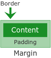
Content area
First and foremost, block-level elements take up the space of their content, content referring to text, images, or whatever else is inside. Unless specified in your styling, block-level elements normally take up the width of the parent (the one the block-level element is inside) element and the height of the content. This is why a block-level element doesn't render if you don't put anything in it; it will have a height of 0 and be invisible.
Padding area
Around the content lies the padding area. This is space still technically inside the element, but might appear outside of it if you don't have a visible border set.
Padding is mostly important when you have a visible border. Without padding, the content will run up against the border and look awkward.
Border area
The border area is the explicit end of the element, spacially. If the border isn't set, it doesn't take up space. (This is the "box" in the box model.)
If you want a border, you'll have to set one in your styling. I'll get into setting a border in a moment.
Margin area
Finally, the margin area is the space outside of the element, but still associated with that element. Margins are important for negative space in a layout. Without a margin, elements will touch each other visually, and you might not always want that.
Perhaps a visual would help:
Margins vs. padding
Though both deal with negative space, margins and padding are subtly different. The big difference is that stacked margins collapse: if two elements have an adjacent vertical margin, only the bigger margin will be visible. A thirty pixel margin on top of a ten pixel margin will only have thirty pixels between them. Padding does not collapse; a thirty pixel pad on top of a ten pixel pad will equal forty pixels total.
Setting the margins and padding
Margins and padding are set in identical ways; you can either use any of the four separate declarations to control each side separately, or a shorthand that can control any and all of the four, but a bit more cleanly.
The long way is to specify margin-left, margin-top, margin-right, and margin-bottom separately. Each of these will take any units of measurement: em values, pixels, points, inches, and so on. Negative values will cause elements to overlap and content to spill out of its container.
h3 {
	margin-left: 30px;
	margin-top: 2em; }
This gives the h3 element thirty pixels of margin space on the left side, and two em values of space on the top, which looks like this:
Thirty pixels to the left, two ems up top.
Note the border we've placed around the h3 element. This is to make clear the difference between margin and padding. If we had our declarations like this:
h3 {
	padding-left: 30px;
	padding-top: 2em; }
The h3 element would instead be spaced like this:
Thirty pixels to the left, two ems up top.
Without the border, they might look the same, but they are very much not the same. (Again, remember the collapsing behavior I mentioned earlier.)
The other way to set margins and padding values is using the shorthand margin and padding properties. These take from one to four property values.
- If only one value is specified, that value applies to all four sides of the element.
- If two values are specified, the first value applies to the top and bottom of the element and the second applies to the left and right of the element.
- If three values are specified, the first value applies to the top, second applies to the left and right, and third applies to the bottom if the element.
- If all four are specified, it goes clockwise: top, right, bottom, left.
To demonstrate:
h3 { padding: 40px; }Forty pixels all around this time.
The shorthand comes most in handy with the auto value, which will center any block-level element with a defined width. Simply set the margin value to auto and it will be centered in the parent. (auto can be used with the separate declarations, but you'll need to set both margin-left and margin-right for it to work.)
h3 {
	width: 640px;
	margin: 2em auto; }
Two ems top and bottom, 640 pixels wide, and centered.
(If you're trying to center text or inline elements, text-align: center; is the declaration you're looking for. margin: auto; only applies to block-level elements.)
Shorthand vs. margin-left, margin-right, and so on
You can use either the separate declarations or the shorthand for margins and padding. The shorthand is cleaner, but the separate declarations might be easier and less confusing in case you forget the orders of the values, or if you only want to set the value for one side. Up to you.
Setting the border
Borders work similarly to margins and padding. There's four properties for setting each side individually, and a shorthand for setting all four sides (and only all four sides this time). All of these take the same three values: the border's width, the border's style, and the color, in that order.
h3 {
	border: 5px dotted #1A8E28;
	padding: 1em auto; }
Thick green dotted border, plus a bit of padding.
If you're only looking for a simple box, 1px solid will work nicely. There's many, many options for border thickness and styles, however, more than we could go over in this tutorial. Look to the "Further Reading" section for a full list.
Summary:
- Elements on your page use what's called the "box model" to determine how much space they take up. The box model defines four distinct areas of space for each element.
- The content area is the space the content of the element takes up—any text, images, and so on.
- The padding area is space within the element.
- The border area is the explicit spacial end of the element.
- The margin area is the space around the elements.
- Though both deal with negative space, adjacent vertical margins will collapse (only the larger margin will be visible), while adjacent vertical padding will not.
- The
marginandpaddingdeclarations both have the same syntax: either four declarations to control each side of the element, or one shorthand that can take up to four values.- Using the shorthand is cleaner and more consistent: rather than having four differing spacing values, you'll have one applied equally to the entire element, making the page look more even. Try to use the shorthand when you can.
- Setting a block-level element's margins to
auto, provided that element has a defined width, will center it in the parent.
- The
borderdeclaration takes the width, border type, and color of the border and applies them to all four sides automatically.- You can use the
border-left,border-right,border-top, andborder-bottomdeclarations to control each side individually.
- You can use the