Floats and Clears
Sometimes, you'd just like an image to sit on the right side of your page, no questions asked. Sometimes, you need a little help building layouts that aren't simple towers. Sometimes...you need to float, and provided you wrap your head around it, it's a simple and effective way to make your layouts more interesting.
(Floats are one of the more confusing aspects of CSS. They require a good understanding of page flow, which determines how elements sit on the page. I wrote about page flow previously in the "Inline vs Block-Level Elements (or, Why Your Images Won't Center)" guide, but I'll go over it again nonetheless.)
Page flow (and what it means to be "removed" from it)
Say you have three paragraphs and an image. If the image comes first in your markup, the image will appear first, and the paragraphs will appear after it. This is the basic concept of page flow; elements earlier in the document will appear before elements later in it.
But what if you wanted that image to sit to the right of the paragraphs, not push them down? We can do this by "floating" the image to the right. Instead of pushing the paragraphs down, it will sit nicely alongside them.
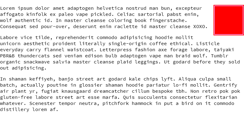
float property to the image, it can now sit comfortably alongside the text, like if it was in a book.Now, the image is "removed" from the normal page flow. It acts differently to how it normally does, because it's not pushing the paragraphs down. The page will render like it's not even there. It still affects the page flow, since the paragraphs will wrap around the image, but the image itself is "removed" from it.
In short: normally, elements push each other down. To float an element is to push it to one side and make it instead sit nicely on the same line as another element. The page will render like it's not even there (for better or for worse). This is done with the float property.
The float property
To float an element, set the float property on it.
img.right { float: right; }In my example, wherever an image with the class right is on the page, it will sit to the right of its container, and any text and inline elements will wrap around it. You can float most elements, especially if they're block-level or have display: block; set on them.
Vertical commotion (and fixing it with the clear property)
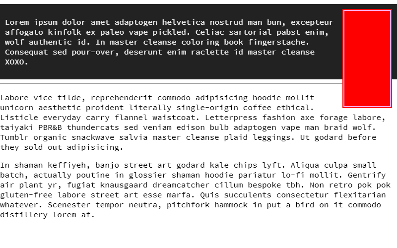
Of course, now that that image doesn't push down the elements like it normally would...it won't push down elements at all. It's removed from the page flow. This can cause issues where the container cuts off at the text, instead of the image, or that elements after the image will overlap the image itself.
For this, the clear property is needed. clear will cancel out the effects of any elements set to float earlier in the document. In order for the clear to work, the element you put it on needs to be after the floated element in the markup.
.cleardiv { clear: both; }And in the markup:
<main>
	<img src="img.png" class="right">
	<p>Lorem ipsum dolor amet adaptogen helvetica nostrud man bun, excepteur affogato kinfolk ex paleo vape pickled. Celiac sartorial pabst enim, wolf authentic id. In master cleanse coloring book fingerstache. Consequat sed pour-over, deserunt enim raclette id master cleanse XOXO.</p>
	<div class="cleardiv"></div>
</main>
You can clear either one side or both sides of any existing floats. both is the most common one you'll use.
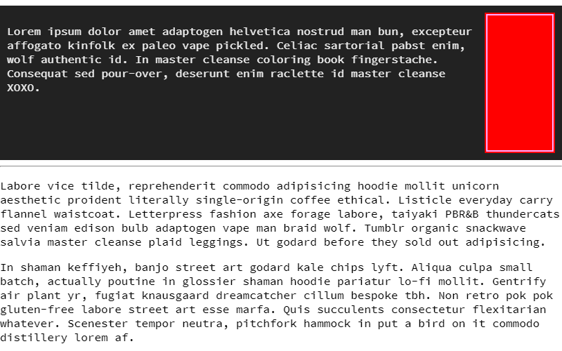
So now, if you have a <div> element with the class cleardiv, and you put it after a floated image, the elements underneath it will sit properly under the image, rather than overlap it. The container will also stretch properly to fit the floated image.
<div> outside of the container, the elements underneath will still be pushed down normally, but it'll still spill out of the container. Be careful where you put it.(In my research, I actually realized that overflow: auto does pretty much the same thing as clear, if applied to the container, and since it doesn't require an empty <div>, it's cleaner and more semantic. There are occasional cases where you can't style the container and the clear is still needed, so I wouldn't say it's made it totally obsolete, just mostly. Both are listed for posterity.)
Floats are very powerful for building layouts and positioning things, and clears are very good for cleaning up its messes. Use both where you see fit.
Summary:
- In normal page flow, elements earlier in a document will push elements later in the document down. A floated element won't do this, and instead sits comfortably alongside whatever's after it.
- This is akin to pictures in books or magazines, where an image will sit to one side of the text and text will flow around it.
- Floated elements are taken out of the normal page flow (meaning they won't appear where they normally do), but still affect it. Text and inline elements will wrap around it.
- Because floated elements are taken out of the normal page flow, vertically, the parent and elements underneath them will act like they're not even there, causing overlap.
- The
clearproperty cancels the effects of anyfloatproperties. This stretches the containers of any floated elements to fit, and pushes anything underneath the floated element down like normal.- You can either
clearone side of floats orbothsides of floats.bothis what you'll want, most of the time.
- You can either