The summer work is the finished. The fall work begin is the tomorrow. Now I am become sleepy, the goer to bed, father of the pjs after drinking chocolate banana smoothie
Current Mood: hopeful
Current Music: Supertramp – “School”
The summer work is the finished. The fall work begin is the tomorrow. Now I am become sleepy, the goer to bed, father of the pjs after drinking chocolate banana smoothie
Current Mood: hopeful
Current Music: Supertramp – “School”
Wazzup
Current Mood: accomplished
Current Music: The music they’re playing on the radio in this room I am in

Little doodle sketch thing of everyone’s favorite aardwolf, Kevin! It is Pennyverse month after all, so it only felt right to give drawing him a shot. This was last week so some of you’ll remember this =P but I hadn’t put it anywhere else yet. Here’ll do, maybe it’ll show up on my art page because I tend to put sketches there.
Life update: school’s starting the day after tomorrow. Meaning my summer work is due! So honestly that’ll be a relief.
Also I’m trying LJ some more. Only gonna make it official if I end up using it. So expect really dumb short posts if I make it work! Its mobile editor is kinda funny.
Current Mood: contemplative
Current Music: U2 – That album apple made everyone listen to
How do i use this
Current Mood: curious
Current Music: BJ Thomas – Raindrops Keep Falling.mid
So around a week ago I decided to put together a mix CD. In part for myself to play on the CD Walkman I started bringing to school, in part because having a physical time capsule of my obsessive listening habits is near-fascinating to me, and in part because I thought the idea of burning your own discs to share with friends or whoever you cross the street was just dang pure to begin with. When you’ve got the right mindset, 2021 is whatever year you want it to be. Spotify can eat my trout.
I started it off as a kind of odd assortment of music I’ve found myself listening to the past few years, including works of Vansire and c.layne. Unfortunately it was really tough to actually make anything of it so that it had any kind of rhyme or reason. My familiarity with a lot of that music has dried up a little bit, and I decided that a chop suey of what interests me right now would be most effective.
It took a few days listening and thinking of tracks to add, but I believe I got a good result in the end. A few were prior recommendations from friends, as I find most of my music (new stuff! Starflyer 59, Baldwin Brothers, more Beck), a Grant Lee Buffalo track from the Guitars, Guitars, Guitars compilation I acquired a while back, and a couple bops from the Amplitude OST, hot off the presses. And of course, some frequent repeats from the past month—hence all those Wilco songs. All things considered, it flows pretty decently.

Basically, if I could work it onto the disc, and I had to use nothing but that CD to listen to music for a month, that’s what I picked. And it was a tight fit, too: I actually had to add crossfades in Nero for it to burn onto a 700mb disc. That’s just about 80 minutes of music. No meg wasted. (Well, apart from the lossy compression in some of the tracks, but I’m going for authenticity dangit, I didn’t know what a FLAC was in 2005, let alone how to read.)
The final order was pretty much done and got burned on 4/20. Cammy saw the list and wanted to get in on the fun, so I tossed him (and the other people in Outposts) a bin/cue of the burn, and he even thought to put together one of his own as well.

I gave it a burn, and well, I enjoyed it a lot. Cammy’s patrician music taste did not fail.

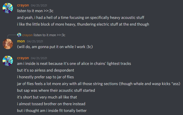
As mentioned, I got pretty into Am I Inside. Right now, Apollo’s a frequent repeat from it: a pretty, kinda sad song about leaving home for the stars. It’s a good assortment of songs, and I like listening my way through on the Walkman a bunch while on transit and at home.
Mix CDs are great. Though I’ve hardly been much of a playlist person with my music, it’s like this more personal and ultimately rewarding way of doing it. It’s something tangible to remember where you are when it comes to music and mood; I can see myself going back to them five years from now, and later. And heck, when you’re on the receiving end, like with Cammy’s mix? That’s a wealth of artists and music that I can dig further into.
Yep, I’d do it again.
A couple days ago I hacked together winvid, a site that lets you download YouTube videos as 144p or 240p wmvs that you can play on Windows Mobile phones or other suitably older equipment.


The backend is a very simple Flask application that runs youtube-dl for downloading the video, and then ffmpeg to convert it into two qualities of WMV. First, it converts the downloaded mp4 into the 240p version, and then that is sampled down to an additional 144p mono version. This is done to save processing time, as the conversion from mp4 to wmv is actually the longest part of the process. Longer videos, naturally, will take a longer time to convert than shorter ones. Just hold on the line a few minutes. Once it’s done, it refreshes the index which lists out all the videos cached.
Regrettably, the site itself will not work on mobile IE due to Replit’s new encryption practices—yet another victim of the ever-spreading “HTTPS-first” philosophy. It will still work on RetroZilla and Opera Mini 5.1 however, so old PCs and pocket devices can still download to their hearts’ content, at least for now.
On mobile, remember that data charges may apply if you’re not downloading over Wi-Fi. If you’re on a prepaid plan like I am, you may find it beneficial to transfer the videos through Bluetooth/microSD/USB, what have you. I have gotten it down to about 2mb per minute for the 144p mono version so it’s just about as efficient as it could be on data, though results will still vary.
As well as Windows Mobile and Pocket PCs, I’m confident that this would be very useful for less equipped, retro processors as well–think your Pentium II-era, and potentially your XP-era machines. People throw 1080p video at these things and when they start skipping frames, deem them useless. In reality, 240p and even 144p are still quite watchable for a lot of videos so long as you aren’t narrowed into the details. I’m looking forward to trying it out under RetroZilla and WMP on some bare metal when I get the time.
It’s a small and niche pet project, but also pretty hackable and adaptable. If you’re the type, I encourage you to fork it, make changes to it, that good stuff. I’ll note that this definitely can be run over a local network as well with a bit of setup. I’ve found it useful, and hope it is for you too.
A couple of years ago, I came to notice something that perplexed me.
Under Blink/Chromium-based browsers and Electron-based applications, colors just did not look the same. My laptops, namely, a ThinkPad X220 and X230T, and my mid-2012 MacBook Pro–likely among other devices with Intel HD Graphics–would always give colors a strange saturation boost within the browser. Images wouldn’t look as they appeared in painting programs, and the default blue links would look more purpleish.
As I’ve been working again on my new personal site, this came to my attention once more. I use Edge as my primary browser, and have been using RetroZilla Composer and SharePoint Designer interchangeably for editing. Let me show you the same page in both stock Microsoft Edge (Chromium) and RetroZilla. Notice how on the left, the page has more saturation than on the right?
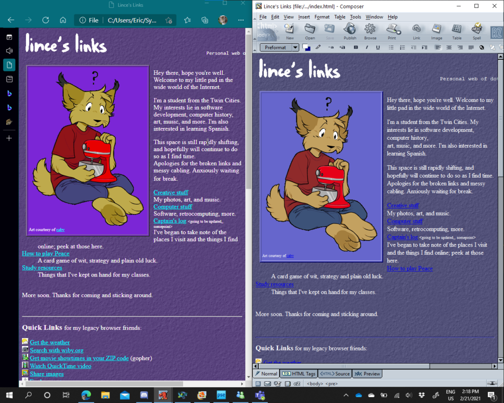
If not, then let me give it another pass or two:

Now Lince is becoming almost an alien, poor lad:
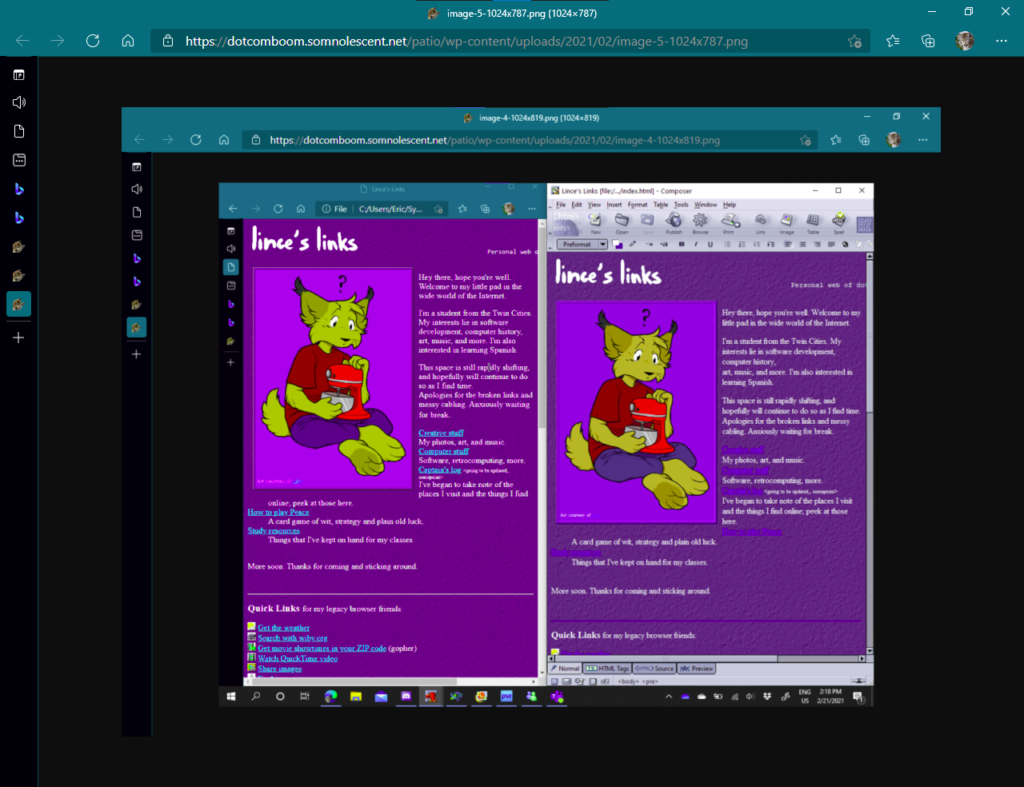
Peculiar, huh? It is also across the whole window, including UI elements. To better illustrate, I saved a page with a #0000FF background and used a color picker to check. Under Edge, it’s displayed as #6700FF, while under IE it is #0000FF as expected. You can test this for yourself as well.


I tested Chrome and Vivaldi with the same results. Though, I tested Firefox, and the color was as it should be. I could’ve sworn the same has happened within that as well, but testing it again seems to prove otherwise. I’ll give Mozilla credit where its due.

Where things really get bizarre, however, is how on my parents’ desktop with Intel UHD Graphics 630 (a later generation chip), and my desktop with Nvidia graphics as pictured below, the color is displayed as expected under Edge. No flags have been changed for this screenshot.
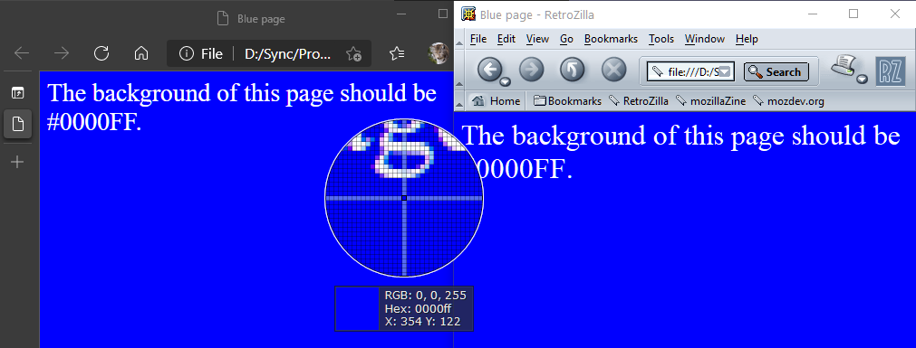
My theory is that Chromium and its descendants respond to the Intel HD Graphics chips’ color profile in some way– either the chip, or possibly some monitor calibration settings from the laptops’ manufacturers. As to why they make this distinction, exactly, I don’t know.
Fortunately, there is a remedy in chrome://flags (or edge://flags, vivaldi://flags, whichever equivalent). I am not aware of a way to apply this tweak through Electron apps which lock that out, but there is a flag to “Force color profile”. Choosing sRGB, the standard color space formulated by Microsoft and HP many moons ago, will make the colors display correctly again.

If anyone knows why this happens, or has had anything similar happen to them, let me know. It’s one of those things I never hear about but still makes me wonder. Additionally, why did we move off of a sRGB default for the Web anyway if it causes these kinds of discrepancies? Shouldn’t HTML colors be rendered just as they are in the markup or stylesheet? And does anyone other than me really even notice?
I rediscovered “digital gardening” earlier today through a site on the XXIIVV webring–cultivating a sort of wiki for yourself, your notes, links, and whatnot. I’ve been seeing some really elaborate ones, and I’ve been thinking about it as I’ve been writing this on a somewhat-lazy December afternoon.
I tend to find something that’s been holding me back from really fleshing out my website with what I’ve dubbed Interest pages or posting a whole ton on my blog has been trying to fit things into a rigid structure, or feeling anxious over a blank page. Thoughts like:
rush all throughout my head whenever I think about writing a self-dubbed Interests page–a section that, I thought, would solve this problem–or a blog post. In the case of a blog post, a lot of a time I coax myself into feeling “This is a blog post so I won’t ever be able to update it again, so it’d better be good and readable on its own or have a genuine point to make!” and then eventually never do it.
By contrast, from what I’ve read, a digital garden’s focus appears to be not only what you come out with in the end, but the process itself of learning and doing–collecting notes, building, growing things up organically.
The phrase “digital garden” is a metaphor for thinking about writing and creating that focuses less on the resulting “showpiece” and more on the process, care, and craft it takes to get there. While not everybody has or works in a dirt garden, we all share a familiarity with the idea of what a garden is. A garden is usually a place where things grow.
🌱 My blog is a digital garden, not a blog (joelhooks.com)
On occasion I come across something I think is neat, say a history of ASCII art, and I want to have some record of it but I don’t want to cluttering up my site’s navigation of copious amounts of pages or write a blog post about a subject I don’t really have authority or much knowledge on. Perhaps I want to keep lists of other interesting things and links I come across over time but don’t want to let making or updating them become a burden.
And as I speak, ideas are brewing in my head. I could use it for like, code snippets, even, little notes about AutoSite features while I work on them, whatever browser extensions I use, programs I use, hoo. And possibly thoughts on the little productivity things and tools I’ve been trying to apply to my workflow, like using a pomodoro timer and tools like Todoist and TickTick. This much content in the form of small notes would feel cluttering, maybe even spammy (several unupdated blog posts stamped in time) in other formats.
This is a really drawn out ramble, but essentially I feel like I’d be able to compile together a whole ton of assorted stuff over time if I could just go off on all sorts of topics that jump in my head without worrying about word count, polish, whether it’s “finished” or even if people are gonna look. And possibly that in its own is an essence of mumblecore.
I think a blog or microblog is like a stream, a standard structured website is like a hierarchial tree with usually one or two sublevels, and a digital garden in this fashion is like a sprawling web, living, breathing, organic. Something poetic like that.
So, yeah. Maybe I’ll give growing a digital garden a try sometime. Thinking about it.
Dropping some links on the subject so I can clear all these tabs..
Some gardens:
Resources/articles:
So, a few days ago I had an idea knocking around to make a Pomodoro timer. I’ve used Pomofocus every now and again but wanted to take a spin at it myself in VB. I was thinking of having it as a desktop application but then thought it’d be more fun to write it as my first proper Compact Framework application. I jotted a mockup down before going to bed, and got to implementing it today.
One thing I really like about Compact Framework development is its close similarities to Winforms. You get a designer (with the option to have a skin for any targeted screen size) and a subset of the controls you’re already familiar with. After about an hour and I had my first minimum viable product, something that could run within an emulator and on my phone. I even found out how to make those CAB installers.

Remember how I said that mobile development was really similar to Winforms? Well, that also means Compact Framework executables are more than happy to run under desktop Windows. (So long as you aren’t using any fancy device APIs, of course.)

A chunk of my time was then spent scratching my head and reading StackOverflow at how to implement playing sounds from the project’s Resources; I ended up giving up on that front, but was able to play the \Windows\Standard.wav sound and just do a system beep if that was not available (Desktop). Couldn’t have the pleasant sounds from Pomofocus unfortunately, rather a smidge loud beep sound. Perhaps later down the line.


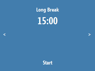


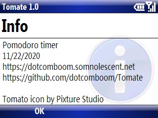
Here’s the final version. I had polished up the UI by adding the arrow indicators on both sides of the screen when the timer is stopped, and replacing the mainMenu control with my own Start/Stop indicator label. All of these have Click events so they’ll work on desktop and Pocket PC. On desktop you can also start with Enter and switch modes with the keyboard using the same key codes internally as Windows Mobile. Convenient!
As I was making a release on GitHub, I found out I could actually target older platforms all the way back to Pocket PC 2003 (a touchscreen platform) without losing support for Windows Mobile 6.1 Standard (a non-touchscreen platform). I had thought that it would refuse to run, but it just worked. That was really cool to see.

I’m very happy with what I got done in the end. One more crossed off my idea list, and something I can really see myself using.
Oh right! You can find Tomate on my site or GitHub. Send feedback and help out if you wish. The CAB’s for installation on mobile devices, and the exe file will work on desktop. Check the readme if you need prerequisites.
(Sidenote: I’m not sure why Visual Studio packages with the CAB extension, uppercase. Alas, possibly one of those fabled Microsoft mysteries we’ll never solve.)