| Name | Type | Use | Default | Fixed | annotation |
| Name | derived by: xs:string | optional | |||
| Version | xs:float | ||||
| Description | xs:string |
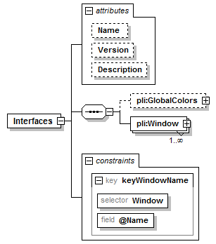
| Name | Refer | Selector | Field(s) | |
| key | keyWindowName | Window | @Name |
| diagram | |
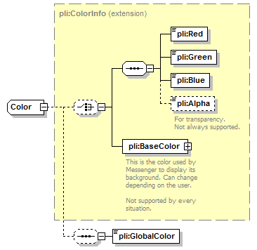
||||||||||||||||||||||||
| children | pli:GlobalColors pli:Window | ||||||||||||||||||||||||
| attributes |
|
||||||||||||||||||||||||
| identity constraints |
|
| type | restriction of xs:string | ||
| properties |
|
||
| facets |
|
| type | xs:float |
| type | xs:string |
| diagram | 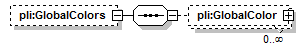 |
||||
| properties |
|
||||
| children | pli:GlobalColor |
| diagram | 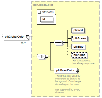 |
||||||||||||
| type | pli:GlobalColor | ||||||||||||
| properties |
|
||||||||||||
| children | pli:Red pli:Green pli:Blue pli:Alpha pli:BaseColor | ||||||||||||
| attributes |
|
| diagram |  |
||||||||||||||||||||||||||||||||||||
| type | pli:Window | ||||||||||||||||||||||||||||||||||||
| properties |
|
||||||||||||||||||||||||||||||||||||
| children | pli:Attributes pli:TitleBar pli:Position pli:DialogTmpl pli:WindowTmpl pli:ChildTmpl pli:Elements pli:ElementGroups pli:Controls | ||||||||||||||||||||||||||||||||||||
| attributes |
|
| diagram |  |
||
| type | extension of pli:PathChunk | ||
| properties |
|
||
| children | pli:Left pli:Top pli:Width pli:Height pli:StartAngle pli:SweepAngle |
| type | xs:int |
| type | xs:int |
| type | restriction of xs:unsignedInt | ||
| facets |
|
| type | restriction of xs:unsignedInt | ||
| facets |
|
| type | restriction of xs:int | ||||
| facets |
|
||||
| annotation |
|
| type | restriction of xs:int | ||||
| facets |
|
||||
| annotation |
|
| diagram |  |
||||||||||||||||||||
| type | extension of pli:Element | ||||||||||||||||||||
| properties |
|
||||||||||||||||||||
| children | pli:Position pli:Attributes pli:Color | ||||||||||||||||||||
| attributes |
|
| diagram |  |
| children | pli:Orientation |
| type | restriction of xs:string | ||||
| facets |
|
| diagram |  |
| type | pli:Color |
| children | pli:Red pli:Green pli:Blue pli:Alpha pli:BaseColor pli:GlobalColor |
| diagram | 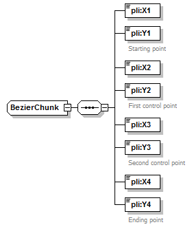 |
||
| type | extension of pli:PathChunk | ||
| properties |
|
||
| children | pli:X1 pli:Y1 pli:X2 pli:Y2 pli:X3 pli:Y3 pli:X4 pli:Y4 |
| type | xs:int |
| type | xs:int | ||
| annotation |
|
| type | xs:int |
| type | xs:int | ||
| annotation |
|
| type | xs:int |
| type | xs:int | ||
| annotation |
|
| type | xs:int |
| type | xs:int | ||
| annotation |
|
| diagram |  |
||||||||||||||||||||||||||
| type | extension of pli:Control | ||||||||||||||||||||||||||
| properties |
|
||||||||||||||||||||||||||
| children | pli:Position pli:Help pli:Attributes pli:BorderColor | ||||||||||||||||||||||||||
| attributes |
|
| diagram | 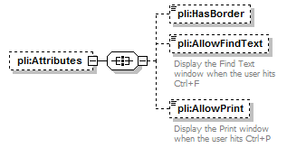 |
||||
| properties |
|
||||
| children | pli:HasBorder pli:AllowFindText pli:AllowPrint |
| type | xs:boolean | ||||||
| properties |
|
| type | xs:boolean | ||||||
| properties |
|
||||||
| annotation |
|
| type | xs:boolean | ||||||
| properties |
|
||||||
| annotation |
|
| diagram |  |
||||
| type | pli:Color | ||||
| properties |
|
||||
| children | pli:Red pli:Green pli:Blue pli:Alpha pli:BaseColor pli:GlobalColor |
| diagram | 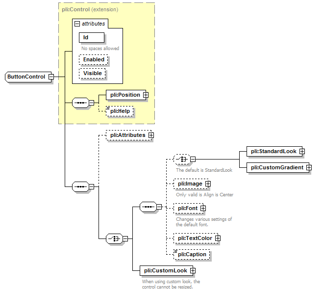 |
||||||||||||||||||||||||||
| type | extension of pli:Control | ||||||||||||||||||||||||||
| properties |
|
||||||||||||||||||||||||||
| children | pli:Position pli:Help pli:Attributes pli:StandardLook pli:CustomGradient pli:Image pli:Font pli:TextColor pli:Caption pli:CustomLook | ||||||||||||||||||||||||||
| attributes |
|
| diagram | 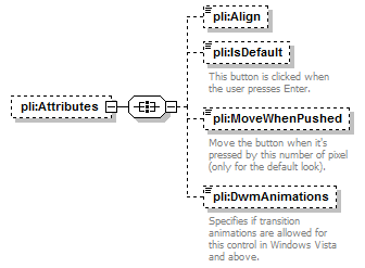 |
||||
| properties |
|
||||
| children | pli:Align pli:IsDefault pli:MoveWhenPushed pli:DwmAnimations |
| type | restriction of xs:string | ||||||
| properties |
|
||||||
| facets |
|
| type | xs:boolean | ||||||
| properties |
|
||||||
| annotation |
|
| type | restriction of xs:unsignedByte | ||||||
| properties |
|
||||||
| facets |
|
||||||
| annotation |
|
| type | restriction of xs:string | ||||||
| properties |
|
||||||
| facets |
|
||||||
| annotation |
|
| diagram | 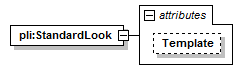 |
||||||||||||
| attributes |
|
| type | restriction of xs:string | ||||||||||
| properties |
|
||||||||||
| facets |
|
| diagram | 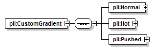 |
| children | pli:Normal pli:Hot pli:Pushed |
| diagram | 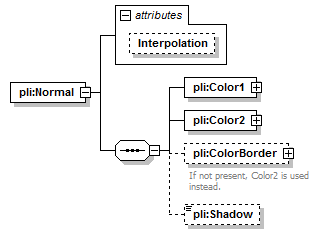 |
||||||||||||
| children | pli:Color1 pli:Color2 pli:ColorBorder pli:Shadow | ||||||||||||
| attributes |
|
| type | restriction of xs:string | ||||||
| properties |
|
||||||
| facets |
|
| diagram |  |
| type | pli:Color |
| children | pli:Red pli:Green pli:Blue pli:Alpha pli:BaseColor pli:GlobalColor |
| type | pli:Color |
| children | pli:Red pli:Green pli:Blue pli:Alpha pli:BaseColor pli:GlobalColor |
| type | pli:Color | ||||
| properties |
|
||||
| children | pli:Red pli:Green pli:Blue pli:Alpha pli:BaseColor pli:GlobalColor | ||||
| annotation |
|
| type | xs:boolean | ||||||
| properties |
|
| diagram | 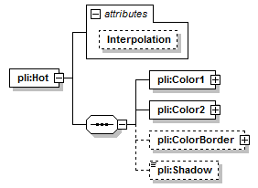 |
||||||||||||
| children | pli:Color1 pli:Color2 pli:ColorBorder pli:Shadow | ||||||||||||
| attributes |
|
| type | restriction of xs:string | ||||||
| properties |
|
||||||
| facets |
|
| diagram | 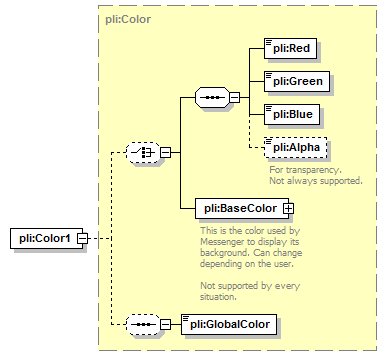 |
| type | pli:Color |
| children | pli:Red pli:Green pli:Blue pli:Alpha pli:BaseColor pli:GlobalColor |
| type | pli:Color |
| children | pli:Red pli:Green pli:Blue pli:Alpha pli:BaseColor pli:GlobalColor |
| type | pli:Color | ||||
| properties |
|
||||
| children | pli:Red pli:Green pli:Blue pli:Alpha pli:BaseColor pli:GlobalColor |
| type | xs:boolean | ||||||
| properties |
|
| diagram | 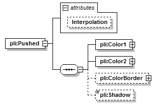 |
||||||||||||
| children | pli:Color1 pli:Color2 pli:ColorBorder pli:Shadow | ||||||||||||
| attributes |
|
| type | restriction of xs:string | ||||||
| properties |
|
||||||
| facets |
|
| diagram |  |
| type | pli:Color |
| children | pli:Red pli:Green pli:Blue pli:Alpha pli:BaseColor pli:GlobalColor |
| type | pli:Color |
| children | pli:Red pli:Green pli:Blue pli:Alpha pli:BaseColor pli:GlobalColor |
| type | pli:Color | ||||
| properties |
|
||||
| children | pli:Red pli:Green pli:Blue pli:Alpha pli:BaseColor pli:GlobalColor |
| type | xs:boolean | ||||||
| properties |
|
| diagram | 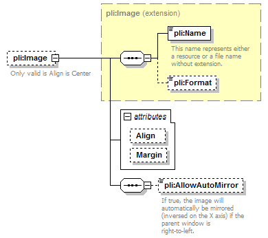 |
||||||||||||||||||
| type | extension of pli:Image | ||||||||||||||||||
| properties |
|
||||||||||||||||||
| children | pli:Name pli:Format pli:AllowAutoMirror | ||||||||||||||||||
| attributes |
|
||||||||||||||||||
| annotation |
|
| type | restriction of xs:string | ||||
| properties |
|
||||
| facets |
|
| type | xs:int | ||
| properties |
|
| type | xs:boolean | ||||||
| properties |
|
||||||
| annotation |
|
| diagram |  |
||||
| properties |
|
||||
| children | pli:FaceName pli:Bold pli:Italic pli:Underlined pli:Strikeout pli:Size | ||||
| annotation |
|
| type | xs:string | ||||
| properties |
|
| type | xs:boolean | ||||
| properties |
|
| type | xs:boolean | ||||
| properties |
|
| type | xs:boolean | ||||
| properties |
|
| type | xs:boolean | ||||
| properties |
|
| type | xs:double | ||||||
| properties |
|
||||||
| annotation |
|
| diagram | 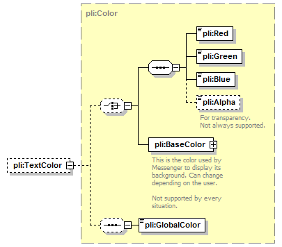 |
||||
| type | pli:Color | ||||
| properties |
|
||||
| children | pli:Red pli:Green pli:Blue pli:Alpha pli:BaseColor pli:GlobalColor |
| type | xs:string | ||||
| properties |
|
| diagram | 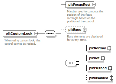 |
||
| children | pli:FocusRect pli:Base pli:Normal pli:Hot pli:Pushed pli:Disabled | ||
| annotation |
|
| diagram |  |
||
| children | pli:Left pli:Top pli:Right pli:Bottom | ||
| annotation |
|
| type | xs:int |
| type | xs:int |
| type | xs:int |
| type | xs:int |
| diagram |  |
||||
| properties |
|
||||
| children | pli:Element | ||||
| annotation |
|
| diagram |  |
||||||||||||||||||||
| type | pli:Element | ||||||||||||||||||||
| properties |
|
||||||||||||||||||||
| children | pli:Position | ||||||||||||||||||||
| attributes |
|
| diagram | 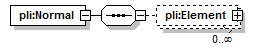 |
| children | pli:Element |
| type | pli:Element | ||||||||||||||||||||
| properties |
|
||||||||||||||||||||
| children | pli:Position | ||||||||||||||||||||
| attributes |
|
| diagram | 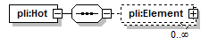 |
| children | pli:Element |
| type | pli:Element | ||||||||||||||||||||
| properties |
|
||||||||||||||||||||
| children | pli:Position | ||||||||||||||||||||
| attributes |
|
| diagram | 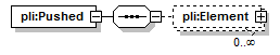 |
| children | pli:Element |
| type | pli:Element | ||||||||||||||||||||
| properties |
|
||||||||||||||||||||
| children | pli:Position | ||||||||||||||||||||
| attributes |
|
| diagram | 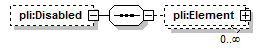 |
||||
| properties |
|
||||
| children | pli:Element |
| type | pli:Element | ||||||||||||||||||||
| properties |
|
||||||||||||||||||||
| children | pli:Position | ||||||||||||||||||||
| attributes |
|
| diagram | 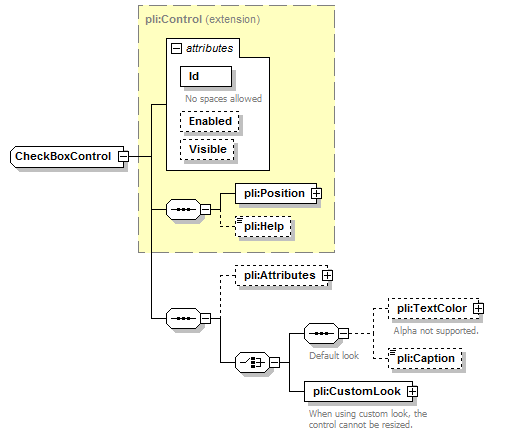 |
||||||||||||||||||||||||||
| type | extension of pli:Control | ||||||||||||||||||||||||||
| properties |
|
||||||||||||||||||||||||||
| children | pli:Position pli:Help pli:Attributes pli:TextColor pli:Caption pli:CustomLook | ||||||||||||||||||||||||||
| attributes |
|
| diagram | 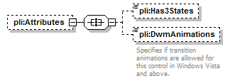 |
||||
| properties |
|
||||
| children | pli:Has3States pli:DwmAnimations |
| type | xs:boolean | ||||||
| properties |
|
| type | restriction of xs:string | ||||||
| properties |
|
||||||
| facets |
|
||||||
| annotation |
|
| diagram | 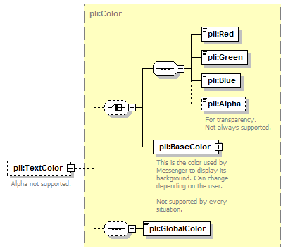 |
||||
| type | pli:Color | ||||
| properties |
|
||||
| children | pli:Red pli:Green pli:Blue pli:Alpha pli:BaseColor pli:GlobalColor | ||||
| annotation |
|
| type | xs:string | ||||
| properties |
|
| diagram |  |
||
| children | pli:FocusRect pli:Base pli:Normal pli:Hot pli:Pushed pli:Disabled | ||
| annotation |
|
| diagram | 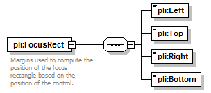 |
||
| children | pli:Left pli:Top pli:Right pli:Bottom | ||
| annotation |
|
| type | xs:int |
| type | xs:int |
| type | xs:int |
| type | xs:int |
| diagram | 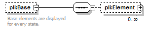 |
||||
| properties |
|
||||
| children | pli:Element | ||||
| annotation |
|
| diagram |  |
||||||||||||||||||||
| type | pli:Element | ||||||||||||||||||||
| properties |
|
||||||||||||||||||||
| children | pli:Position | ||||||||||||||||||||
| attributes |
|
| diagram | 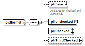 |
| children | pli:Base pli:Unchecked pli:Checked pli:ThirdChecked |
| diagram |  |
||||
| properties |
|
||||
| children | pli:Element | ||||
| annotation |
|
| type | pli:Element | ||||||||||||||||||||
| properties |
|
||||||||||||||||||||
| children | pli:Position | ||||||||||||||||||||
| attributes |
|
| diagram |  |
| children | pli:Element |
| type | pli:Element | ||||||||||||||||||||
| properties |
|
||||||||||||||||||||
| children | pli:Position | ||||||||||||||||||||
| attributes |
|
| diagram |  |
| children | pli:Element |
| type | pli:Element | ||||||||||||||||||||
| properties |
|
||||||||||||||||||||
| children | pli:Position | ||||||||||||||||||||
| attributes |
|
| diagram | 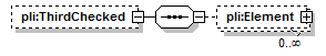 |
||||
| properties |
|
||||
| children | pli:Element |
| type | pli:Element | ||||||||||||||||||||
| properties |
|
||||||||||||||||||||
| children | pli:Position | ||||||||||||||||||||
| attributes |
|
| diagram | 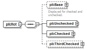 |
| children | pli:Base pli:Unchecked pli:Checked pli:ThirdChecked |
| diagram |  |
||||
| properties |
|
||||
| children | pli:Element | ||||
| annotation |
|
| type | pli:Element | ||||||||||||||||||||
| properties |
|
||||||||||||||||||||
| children | pli:Position | ||||||||||||||||||||
| attributes |
|
| diagram |  |
| children | pli:Element |
| type | pli:Element | ||||||||||||||||||||
| properties |
|
||||||||||||||||||||
| children | pli:Position | ||||||||||||||||||||
| attributes |
|
| diagram |  |
| children | pli:Element |
| type | pli:Element | ||||||||||||||||||||
| properties |
|
||||||||||||||||||||
| children | pli:Position | ||||||||||||||||||||
| attributes |
|
| diagram |  |
||||
| properties |
|
||||
| children | pli:Element |
| type | pli:Element | ||||||||||||||||||||
| properties |
|
||||||||||||||||||||
| children | pli:Position | ||||||||||||||||||||
| attributes |
|
| diagram | 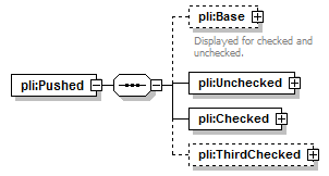 |
| children | pli:Base pli:Unchecked pli:Checked pli:ThirdChecked |
| diagram |  |
||||
| properties |
|
||||
| children | pli:Element | ||||
| annotation |
|
| type | pli:Element | ||||||||||||||||||||
| properties |
|
||||||||||||||||||||
| children | pli:Position | ||||||||||||||||||||
| attributes |
|
| diagram |  |
| children | pli:Element |
| type | pli:Element | ||||||||||||||||||||
| properties |
|
||||||||||||||||||||
| children | pli:Position | ||||||||||||||||||||
| attributes |
|
| diagram |  |
| children | pli:Element |
| type | pli:Element | ||||||||||||||||||||
| properties |
|
||||||||||||||||||||
| children | pli:Position | ||||||||||||||||||||
| attributes |
|
| diagram |  |
||||
| properties |
|
||||
| children | pli:Element |
| type | pli:Element | ||||||||||||||||||||
| properties |
|
||||||||||||||||||||
| children | pli:Position | ||||||||||||||||||||
| attributes |
|
| diagram | 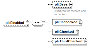 |
||||
| properties |
|
||||
| children | pli:Base pli:Unchecked pli:Checked pli:ThirdChecked |
| diagram |  |
||||
| properties |
|
||||
| children | pli:Element | ||||
| annotation |
|
| type | pli:Element | ||||||||||||||||||||
| properties |
|
||||||||||||||||||||
| children | pli:Position | ||||||||||||||||||||
| attributes |
|
| diagram |  |
| children | pli:Element |
| type | pli:Element | ||||||||||||||||||||
| properties |
|
||||||||||||||||||||
| children | pli:Position | ||||||||||||||||||||
| attributes |
|
| diagram |  |
| children | pli:Element |
| type | pli:Element | ||||||||||||||||||||
| properties |
|
||||||||||||||||||||
| children | pli:Position | ||||||||||||||||||||
| attributes |
|
| diagram |  |
||||
| properties |
|
||||
| children | pli:Element |
| type | pli:Element | ||||||||||||||||||||
| properties |
|
||||||||||||||||||||
| children | pli:Position | ||||||||||||||||||||
| attributes |
|
| diagram |  |
||||||||||||||||||||||||||
| type | extension of pli:Control | ||||||||||||||||||||||||||
| properties |
|
||||||||||||||||||||||||||
| children | pli:Position pli:Help pli:Attributes | ||||||||||||||||||||||||||
| attributes |
|
||||||||||||||||||||||||||
| annotation |
|
| diagram | 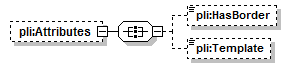 |
||||
| properties |
|
||||
| children | pli:HasBorder pli:Template |
| type | xs:boolean | ||||||
| properties |
|
| type | restriction of xs:string | ||||||
| properties |
|
||||||
| facets |
|
| type | xs:string |
| diagram | 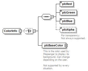 |
||
| children | pli:Red pli:Green pli:Blue pli:Alpha pli:BaseColor | ||
| used by |
|
| type | restriction of xs:unsignedByte | ||||
| facets |
|
| type | restriction of xs:unsignedByte | ||||
| facets |
|
| type | restriction of xs:unsignedByte | ||||
| facets |
|
| type | restriction of xs:unsignedByte | ||||||
| properties |
|
||||||
| facets |
|
||||||
| annotation |
|
| diagram | 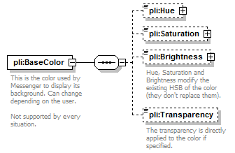 |
||
| children | pli:Hue pli:Saturation pli:Brightness pli:Transparency | ||
| annotation |
|
| diagram | 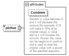 |
||||||||||||||
| type | extension of xs:double | ||||||||||||||
| properties |
|
||||||||||||||
| attributes |
|
| type | restriction of xs:string | ||||
| properties |
|
||||
| facets |
|
||||
| annotation |
|
| diagram |  |
||||||||||||
| type | extension of xs:double | ||||||||||||
| properties |
|
||||||||||||
| attributes |
|
| type | restriction of xs:string | ||||
| properties |
|
||||
| facets |
|
| diagram |  |
||||||||||||
| type | extension of xs:double | ||||||||||||
| properties |
|
||||||||||||
| attributes |
|
||||||||||||
| annotation |
|
| type | restriction of xs:string | ||||
| properties |
|
||||
| facets |
|
| type | restriction of xs:unsignedByte | ||||||
| properties |
|
||||||
| facets |
|
||||||
| annotation |
|
| diagram |  |
||||||||||||||||||||||||||
| type | extension of pli:Control | ||||||||||||||||||||||||||
| properties |
|
||||||||||||||||||||||||||
| children | pli:Position pli:Help pli:Attributes pli:BorderColor pli:Images pli:Items | ||||||||||||||||||||||||||
| attributes |
|
||||||||||||||||||||||||||
| annotation |
|
| diagram |  |
||||
| properties |
|
||||
| children | pli:AcceptFiles pli:AllowEdit pli:AutoSort pli:OwnerDraw |
| type | xs:boolean | ||||||
| properties |
|
| type | xs:boolean | ||||||
| properties |
|
| type | xs:boolean | ||||||
| properties |
|
||||||
| annotation |
|
| type | restriction of xs:string | ||||||
| properties |
|
||||||
| facets |
|
| diagram |  |
||||
| type | pli:Color | ||||
| properties |
|
||||
| children | pli:Red pli:Green pli:Blue pli:Alpha pli:BaseColor pli:GlobalColor |
| diagram |  |
||||
| properties |
|
||||
| children | pli:Image | ||||
| annotation |
|
| diagram | 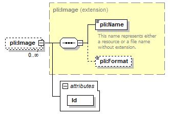 |
||||||||||||
| type | extension of pli:Image | ||||||||||||
| properties |
|
||||||||||||
| children | pli:Name pli:Format | ||||||||||||
| attributes |
|
| type | xs:string | ||
| properties |
|
| diagram |  |
||||
| properties |
|
||||
| children | pli:Item | ||||
| annotation |
|
| diagram | 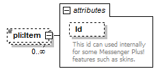 |
||||||||||||||
| type | extension of xs:string | ||||||||||||||
| properties |
|
||||||||||||||
| attributes |
|
| type | xs:string | ||
| properties |
|
||
| annotation |
|
| diagram | 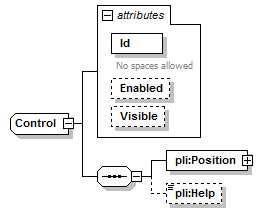 |
||||||||||||||||||||||||||
| properties |
|
||||||||||||||||||||||||||
| children | pli:Position pli:Help | ||||||||||||||||||||||||||
| used by |
|
||||||||||||||||||||||||||
| attributes |
|
| type | restriction of xs:string | ||
| properties |
|
||
| facets |
|
||
| annotation |
|
| type | xs:boolean | ||||
| properties |
|
| type | xs:boolean | ||
| properties |
|
| diagram | 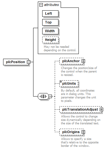 |
||||||||||||||||||||||||||||||||
| children | pli:Anchor pli:Units pli:TranslationAdjust pli:Origins | ||||||||||||||||||||||||||||||||
| attributes |
|
| type | xs:int | ||
| properties |
|
| type | xs:int | ||
| properties |
|
| type | xs:unsignedInt | ||
| properties |
|
| type | xs:unsignedInt | ||
| properties |
|
||
| annotation |
|
| diagram | 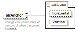 |
||||||||||||||||||
| properties |
|
||||||||||||||||||
| attributes |
|
||||||||||||||||||
| annotation |
|
| type | restriction of xs:string | ||||||
| properties |
|
||||||
| facets |
|
| type | restriction of xs:string | ||||||
| properties |
|
||||||
| facets |
|
| type | restriction of xs:string | ||||||||
| properties |
|
||||||||
| facets |
|
||||||||
| annotation |
|
| diagram | 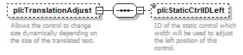 |
||||
| properties |
|
||||
| children | pli:StaticCtrlIDLeft | ||||
| annotation |
|
| type | xs:string | ||||
| properties |
|
||||
| annotation |
|
| diagram | 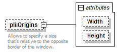 |
||||||||||||||||||
| properties |
|
||||||||||||||||||
| attributes |
|
||||||||||||||||||
| annotation |
|
| type | restriction of xs:string | ||||
| properties |
|
||||
| facets |
|
| type | restriction of xs:string | ||||
| properties |
|
||||
| facets |
|
| type | xs:string | ||||
| properties |
|
| diagram | 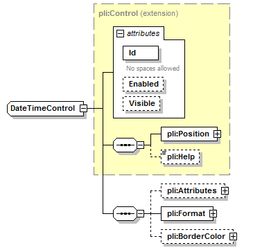 |
||||||||||||||||||||||||||
| type | extension of pli:Control | ||||||||||||||||||||||||||
| properties |
|
||||||||||||||||||||||||||
| children | pli:Position pli:Help pli:Attributes pli:Format pli:BorderColor | ||||||||||||||||||||||||||
| attributes |
|
| diagram | 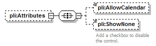 |
||||
| properties |
|
||||
| children | pli:AllowCalendar pli:ShowNone |
| type | xs:boolean | ||||||
| properties |
|
| type | xs:boolean | ||||||
| properties |
|
||||||
| annotation |
|
| diagram | 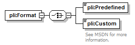 |
| children | pli:Predefined pli:Custom |
| type | restriction of xs:string | ||||||||
| facets |
|
| type | restriction of xs:string | ||
| facets |
|
||
| annotation |
|
| diagram |  |
||||
| type | pli:Color | ||||
| properties |
|
||||
| children | pli:Red pli:Green pli:Blue pli:Alpha pli:BaseColor pli:GlobalColor |
| diagram | 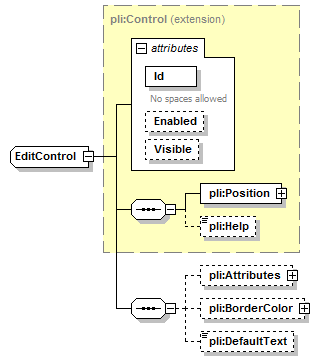 |
||||||||||||||||||||||||||
| type | extension of pli:Control | ||||||||||||||||||||||||||
| properties |
|
||||||||||||||||||||||||||
| children | pli:Position pli:Help pli:Attributes pli:BorderColor pli:DefaultText | ||||||||||||||||||||||||||
| attributes |
|
| diagram | 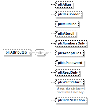 |
||||
| properties |
|
||||
| children | pli:Align pli:HasBorder pli:Multiline pli:VScroll pli:NumbersOnly pli:AcceptFiles pli:IsPassword pli:ReadOnly pli:WantReturn pli:HideSelection |
| type | restriction of xs:string | ||||||
| properties |
|
||||||
| facets |
|
| type | xs:boolean | ||||||
| properties |
|
| type | xs:boolean | ||||||
| properties |
|
| type | xs:boolean | ||||||
| properties |
|
| type | xs:boolean | ||||||
| properties |
|
| type | xs:boolean | ||||||
| properties |
|
| type | xs:boolean | ||||||
| properties |
|
| type | xs:boolean | ||||||
| properties |
|
| type | xs:boolean | ||||||
| properties |
|
||||||
| annotation |
|
| type | xs:boolean | ||||||
| properties |
|
| diagram |  |
||||
| type | pli:Color | ||||
| properties |
|
||||
| children | pli:Red pli:Green pli:Blue pli:Alpha pli:BaseColor pli:GlobalColor |
| type | xs:string | ||||
| properties |
|
| diagram |  |
||||||||||||||||||||
| properties |
|
||||||||||||||||||||
| children | pli:Position | ||||||||||||||||||||
| used by |
|
||||||||||||||||||||
| attributes |
|
| type | restriction of xs:string | ||
| properties |
|
||
| facets |
|
||
| annotation |
|
| type | xs:boolean | ||
| properties |
|
| diagram | 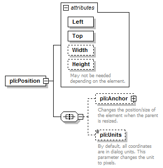 |
||||||||||||||||||||||||||||||||
| children | pli:Anchor pli:Units | ||||||||||||||||||||||||||||||||
| attributes |
|
| type | xs:int | ||
| properties |
|
| type | xs:int | ||
| properties |
|
| type | xs:unsignedInt | ||
| properties |
|
| type | xs:unsignedInt | ||
| annotation |
|
| diagram | 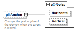 |
||||||||||||||||||
| properties |
|
||||||||||||||||||
| attributes |
|
||||||||||||||||||
| annotation |
|
| type | restriction of xs:string | ||||||
| properties |
|
||||||
| facets |
|
| type | restriction of xs:string | ||||||
| properties |
|
||||||
| facets |
|
| type | restriction of xs:string | ||||||||
| properties |
|
||||||||
| facets |
|
||||||||
| annotation |
|
| diagram | 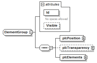 |
||||||||||||||||||||
| children | pli:Position pli:Transparency pli:Elements | ||||||||||||||||||||
| used by |
|
||||||||||||||||||||
| attributes |
|
| type | restriction of xs:string | ||
| properties |
|
||
| facets |
|
||
| annotation |
|
| type | xs:boolean | ||
| properties |
|
| diagram | 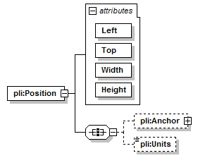 |
||||||||||||||||||||||||||||||
| children | pli:Anchor pli:Units | ||||||||||||||||||||||||||||||
| attributes |
|
| type | xs:int | ||
| properties |
|
| type | xs:int | ||
| properties |
|
| type | xs:unsignedInt | ||
| properties |
|
| type | xs:unsignedInt | ||
| properties |
|
| diagram | 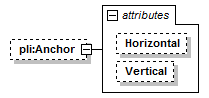 |
||||||||||||||||||
| properties |
|
||||||||||||||||||
| attributes |
|
| type | restriction of xs:string | ||||||
| properties |
|
||||||
| facets |
|
| type | restriction of xs:string | ||||||
| properties |
|
||||||
| facets |
|
| type | restriction of xs:string | ||||||||
| properties |
|
||||||||
| facets |
|
| diagram | 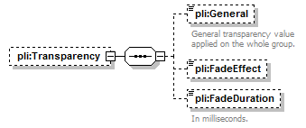 |
||||
| properties |
|
||||
| children | pli:General pli:FadeEffect pli:FadeDuration |
| type | restriction of xs:unsignedInt | ||||||
| properties |
|
||||||
| facets |
|
||||||
| annotation |
|
| type | restriction of xs:string | ||||||||
| properties |
|
||||||||
| facets |
|
| type | restriction of xs:unsignedInt | ||||||
| properties |
|
||||||
| facets |
|
||||||
| annotation |
|
| diagram | 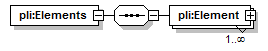 |
| children | pli:Element |
| diagram |  |
||||||||||||||||||||
| type | pli:Element | ||||||||||||||||||||
| properties |
|
||||||||||||||||||||
| children | pli:Position | ||||||||||||||||||||
| attributes |
|
| diagram | 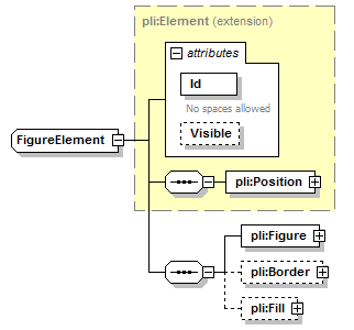 |
||||||||||||||||||||
| type | extension of pli:Element | ||||||||||||||||||||
| properties |
|
||||||||||||||||||||
| children | pli:Position pli:Figure pli:Border pli:Fill | ||||||||||||||||||||
| attributes |
|
| diagram | 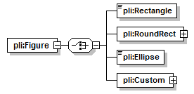 |
| children | pli:Rectangle pli:RoundRect pli:Ellipse pli:Custom |
| diagram | 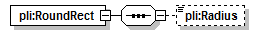 |
| children | pli:Radius |
| type | xs:unsignedInt | ||||||
| properties |
|
| diagram | 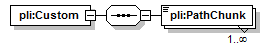 |
| children | pli:PathChunk |
| properties |
|
| diagram |  |
||||
| properties |
|
||||
| children | pli:Size pli:Color |
| type | restriction of xs:unsignedInt | ||||||
| properties |
|
||||||
| facets |
|
| diagram | 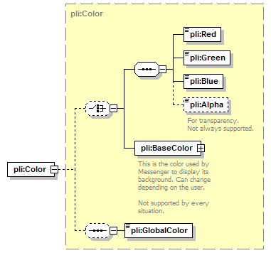 |
| type | pli:Color |
| children | pli:Red pli:Green pli:Blue pli:Alpha pli:BaseColor pli:GlobalColor |
| diagram | 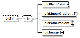 |
||||
| properties |
|
||||
| children | pli:PlainColor pli:LinearGradient pli:PathGradient pli:Image |
| type | pli:Color |
| children | pli:Red pli:Green pli:Blue pli:Alpha pli:BaseColor pli:GlobalColor |
| diagram | 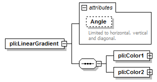 |
||||||||||||||
| children | pli:Color1 pli:Color2 | ||||||||||||||
| attributes |
|
| type | restriction of xs:int | ||||||||||||||
| properties |
|
||||||||||||||
| facets |
|
||||||||||||||
| annotation |
|
| type | pli:Color |
| children | pli:Red pli:Green pli:Blue pli:Alpha pli:BaseColor pli:GlobalColor |
| type | pli:Color |
| children | pli:Red pli:Green pli:Blue pli:Alpha pli:BaseColor pli:GlobalColor |
| diagram | 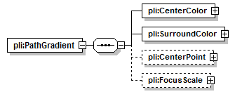 |
| children | pli:CenterColor pli:SurroundColor pli:CenterPoint pli:FocusScale |
| type | pli:Color |
| children | pli:Red pli:Green pli:Blue pli:Alpha pli:BaseColor pli:GlobalColor |
| type | pli:Color |
| children | pli:Red pli:Green pli:Blue pli:Alpha pli:BaseColor pli:GlobalColor |
| diagram |  |
||||||||||||||||||
| properties |
|
||||||||||||||||||
| attributes |
|
| type | xs:int |
| type | xs:int |
| diagram |  |
||||||||||||||||||
| properties |
|
||||||||||||||||||
| attributes |
|
| type | restriction of xs:float | ||||
| facets |
|
| type | restriction of xs:float | ||||
| facets |
|
| diagram |  |
||||||||||||||||||
| type | extension of pli:Image | ||||||||||||||||||
| children | pli:Name pli:Format | ||||||||||||||||||
| attributes |
|
| type | xs:int |
| type | xs:int |
| diagram |  |
||||||||||||
| type | extension of pli:ColorInfo | ||||||||||||
| properties |
|
||||||||||||
| children | pli:Red pli:Green pli:Blue pli:Alpha pli:BaseColor | ||||||||||||
| used by |
|
||||||||||||
| attributes |
|
| type | xs:string | ||
| properties |
|
| diagram | 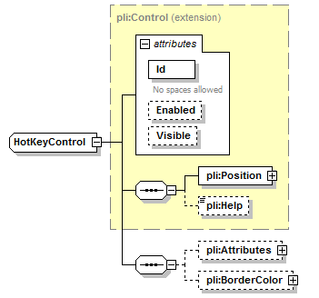 |
||||||||||||||||||||||||||
| type | extension of pli:Control | ||||||||||||||||||||||||||
| properties |
|
||||||||||||||||||||||||||
| children | pli:Position pli:Help pli:Attributes pli:BorderColor | ||||||||||||||||||||||||||
| attributes |
|
| diagram |  |
||||
| properties |
|
||||
| children | pli:HasBorder |
| type | xs:boolean | ||||||
| properties |
|
| diagram | 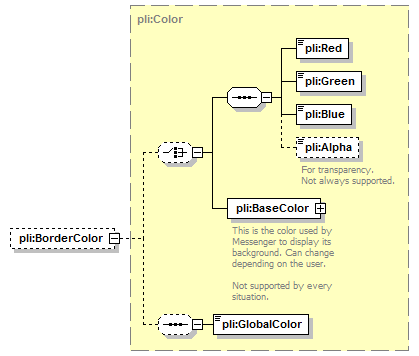 |
||||
| type | pli:Color | ||||
| properties |
|
||||
| children | pli:Red pli:Green pli:Blue pli:Alpha pli:BaseColor pli:GlobalColor |
| diagram | 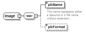 |
||
| children | pli:Name pli:Format | ||
| used by |
|
| type | restriction of xs:string | ||
| facets |
|
||
| annotation |
|
| type | restriction of xs:string | ||||||
| properties |
|
||||||
| facets |
|
| diagram | 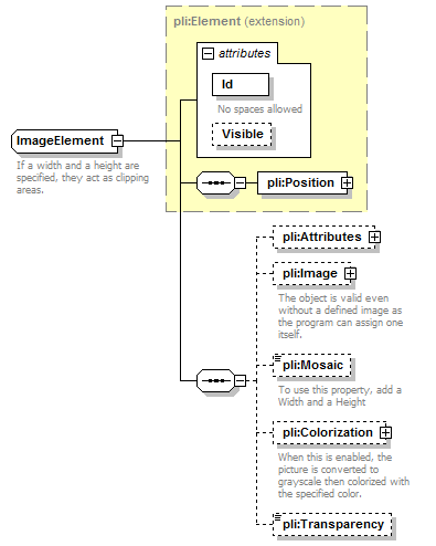 |
||||||||||||||||||||
| type | extension of pli:Element | ||||||||||||||||||||
| properties |
|
||||||||||||||||||||
| children | pli:Position pli:Attributes pli:Image pli:Mosaic pli:Colorization pli:Transparency | ||||||||||||||||||||
| attributes |
|
||||||||||||||||||||
| annotation |
|
| diagram | 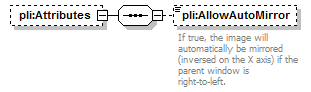 |
||||
| properties |
|
||||
| children | pli:AllowAutoMirror |
| type | xs:boolean | ||||||
| properties |
|
||||||
| annotation |
|
| diagram | 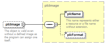 |
||||
| type | pli:Image | ||||
| properties |
|
||||
| children | pli:Name pli:Format | ||||
| annotation |
|
| type | restriction of xs:string | ||||||||||||
| properties |
|
||||||||||||
| facets |
|
||||||||||||
| annotation |
|
| diagram | 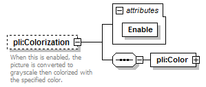 |
||||||||||||
| properties |
|
||||||||||||
| children | pli:Color | ||||||||||||
| attributes |
|
||||||||||||
| annotation |
|
| type | xs:boolean | ||
| properties |
|
| diagram |  |
| type | pli:Color |
| children | pli:Red pli:Green pli:Blue pli:Alpha pli:BaseColor pli:GlobalColor |
| type | restriction of xs:unsignedByte | ||||||
| properties |
|
||||||
| facets |
|
| diagram |  |
||
| type | extension of pli:PathChunk | ||
| properties |
|
||
| children | pli:X1 pli:Y1 pli:X2 pli:Y2 |
| type | xs:int |
| type | xs:int |
| type | xs:int |
| type | xs:int |
| diagram | 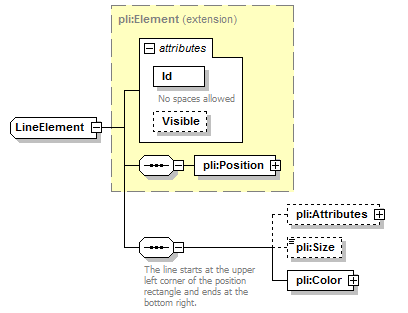 |
||||||||||||||||||||
| type | extension of pli:Element | ||||||||||||||||||||
| properties |
|
||||||||||||||||||||
| children | pli:Position pli:Attributes pli:Size pli:Color | ||||||||||||||||||||
| attributes |
|
| diagram | 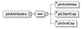 |
||||
| properties |
|
||||
| children | pli:AntiAlias pli:StartCap pli:EndCap |
| type | xs:boolean | ||||||
| properties |
|
| type | restriction of xs:string | ||||||||
| properties |
|
||||||||
| facets |
|
| type | restriction of xs:string | ||||||||
| properties |
|
||||||||
| facets |
|
| type | restriction of xs:unsignedInt | ||||||
| properties |
|
||||||
| facets |
|
| diagram |  |
| type | pli:Color |
| children | pli:Red pli:Green pli:Blue pli:Alpha pli:BaseColor pli:GlobalColor |
| diagram | 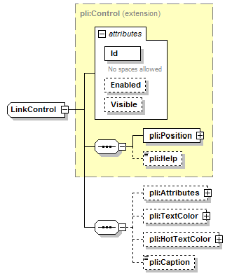 |
||||||||||||||||||||||||||
| type | extension of pli:Control | ||||||||||||||||||||||||||
| properties |
|
||||||||||||||||||||||||||
| children | pli:Position pli:Help pli:Attributes pli:TextColor pli:HotTextColor pli:Caption | ||||||||||||||||||||||||||
| attributes |
|
| diagram | 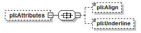 |
||||
| properties |
|
||||
| children | pli:Align pli:Underline |
| type | restriction of xs:string | ||||||
| properties |
|
||||||
| facets |
|
| type | restriction of xs:string | ||||||
| properties |
|
||||||
| facets |
|
| diagram |  |
||||
| type | pli:Color | ||||
| properties |
|
||||
| children | pli:Red pli:Green pli:Blue pli:Alpha pli:BaseColor pli:GlobalColor |
| type | pli:Color | ||||
| properties |
|
||||
| children | pli:Red pli:Green pli:Blue pli:Alpha pli:BaseColor pli:GlobalColor |
| type | xs:string | ||||
| properties |
|
| diagram |  |
||||||||||||||||||||||||||
| type | extension of pli:Control | ||||||||||||||||||||||||||
| properties |
|
||||||||||||||||||||||||||
| children | pli:Position pli:Help pli:Attributes pli:BorderColor pli:Items | ||||||||||||||||||||||||||
| attributes |
|
| diagram |  |
||||
| properties |
|
||||
| children | pli:HasBorder pli:AcceptFiles pli:MultipleSel pli:ReadOnly pli:AutoSort pli:OwnerDraw |
| type | xs:boolean | ||||||
| properties |
|
| type | xs:boolean | ||||||
| properties |
|
| type | xs:boolean | ||||||
| properties |
|
| type | xs:boolean | ||||||
| properties |
|
||||||
| annotation |
|
| type | xs:boolean | ||||||
| properties |
|
||||||
| annotation |
|
| type | restriction of xs:string | ||||||
| properties |
|
||||||
| facets |
|
| diagram |  |
||||
| type | pli:Color | ||||
| properties |
|
||||
| children | pli:Red pli:Green pli:Blue pli:Alpha pli:BaseColor pli:GlobalColor |
| diagram |  |
||||
| properties |
|
||||
| children | pli:Item | ||||
| annotation |
|
| diagram |  |
||||||||||||||
| type | extension of xs:string | ||||||||||||||
| properties |
|
||||||||||||||
| attributes |
|
| type | xs:string | ||
| properties |
|
||
| annotation |
|
| diagram |  |
||||||||||||||||||||||||||
| type | extension of pli:Control | ||||||||||||||||||||||||||
| properties |
|
||||||||||||||||||||||||||
| children | pli:Position pli:Help pli:Attributes pli:LargeIconView pli:SmallIconView pli:ListView pli:ReportView pli:TileView pli:BorderColor pli:Images pli:Columns pli:Groups | ||||||||||||||||||||||||||
| attributes |
|
| diagram | 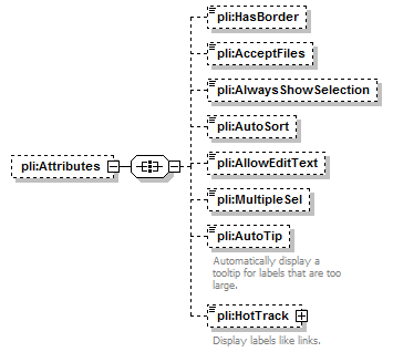 |
||||
| properties |
|
||||
| children | pli:HasBorder pli:AcceptFiles pli:AlwaysShowSelection pli:AutoSort pli:AllowEditText pli:MultipleSel pli:AutoTip pli:HotTrack |
| type | xs:boolean | ||||||
| properties |
|
| type | xs:boolean | ||||||
| properties |
|
| type | xs:boolean | ||||||
| properties |
|
| type | restriction of xs:string | ||||||
| properties |
|
||||||
| facets |
|
| type | xs:boolean | ||||||
| properties |
|
| type | xs:boolean | ||||||
| properties |
|
| type | xs:boolean | ||||||
| properties |
|
||||||
| annotation |
|
| diagram |  |
||||||||||||
| type | extension of xs:boolean | ||||||||||||
| properties |
|
||||||||||||
| attributes |
|
||||||||||||
| annotation |
|
| type | restriction of xs:string | ||||
| properties |
|
||||
| facets |
|
| diagram | 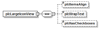 |
| children | pli:ItemsAlign pli:WrapText pli:HasCheckboxes |
| type | restriction of xs:string | ||||||
| properties |
|
||||||
| facets |
|
| type | xs:boolean | ||||||
| properties |
|
| type | xs:boolean | ||||||
| properties |
|
| diagram | 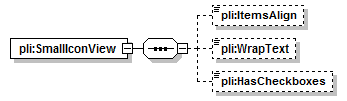 |
| children | pli:ItemsAlign pli:WrapText pli:HasCheckboxes |
| type | restriction of xs:string | ||||||
| properties |
|
||||||
| facets |
|
| type | xs:boolean | ||||||
| properties |
|
| type | xs:boolean | ||||||
| properties |
|
| diagram |  |
| children | pli:HasCheckboxes |
| type | xs:boolean | ||||||
| properties |
|
| diagram | 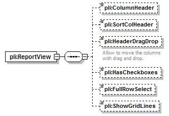 |
| children | pli:ColumnHeader pli:SortColHeader pli:HeaderDragDrop pli:HasCheckboxes pli:FullRowSelect pli:ShowGridLines |
| type | xs:boolean | ||||||
| properties |
|
| type | xs:boolean | ||||||
| properties |
|
| type | xs:boolean | ||||||
| properties |
|
||||||
| annotation |
|
| type | xs:boolean | ||||||
| properties |
|
| type | xs:boolean | ||||||
| properties |
|
| type | xs:boolean | ||||||
| properties |
|
| diagram |  |
||||
| type | pli:Color | ||||
| properties |
|
||||
| children | pli:Red pli:Green pli:Blue pli:Alpha pli:BaseColor pli:GlobalColor |
| diagram | 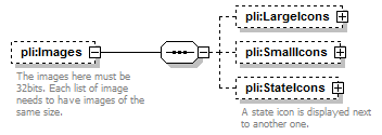 |
||||
| properties |
|
||||
| children | pli:LargeIcons pli:SmallIcons pli:StateIcons | ||||
| annotation |
|
| diagram |  |
||||
| properties |
|
||||
| children | pli:Image |
| diagram | 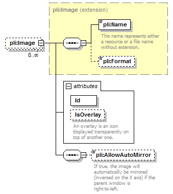 |
||||||||||||||||||||
| type | extension of pli:Image | ||||||||||||||||||||
| properties |
|
||||||||||||||||||||
| children | pli:Name pli:Format pli:AllowAutoMirror | ||||||||||||||||||||
| attributes |
|
| type | xs:string | ||
| properties |
|
| type | xs:boolean | ||
| properties |
|
||
| annotation |
|
| type | xs:boolean | ||||||
| properties |
|
||||||
| annotation |
|
| diagram | 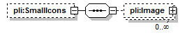 |
||||
| properties |
|
||||
| children | pli:Image |
| diagram | 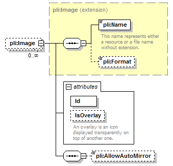 |
||||||||||||||||||||
| type | extension of pli:Image | ||||||||||||||||||||
| properties |
|
||||||||||||||||||||
| children | pli:Name pli:Format pli:AllowAutoMirror | ||||||||||||||||||||
| attributes |
|
| type | xs:string | ||
| properties |
|
| type | xs:boolean | ||
| properties |
|
||
| annotation |
|
| type | xs:boolean | ||||||
| properties |
|
| diagram |  |
||||
| properties |
|
||||
| children | pli:Image | ||||
| annotation |
|
| diagram | 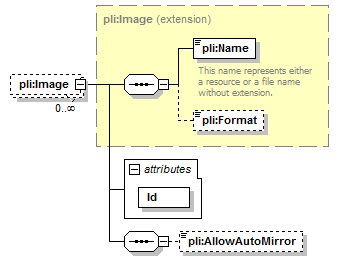 |
||||||||||||
| type | extension of pli:Image | ||||||||||||
| properties |
|
||||||||||||
| children | pli:Name pli:Format pli:AllowAutoMirror | ||||||||||||
| attributes |
|
| type | xs:string | ||
| properties |
|
| type | xs:boolean | ||||||
| properties |
|
| diagram | 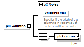 |
||||||||||||||
| properties |
|
||||||||||||||
| children | pli:Column | ||||||||||||||
| attributes |
|
| type | restriction of xs:string | ||||
| properties |
|
||||
| facets |
|
||||
| annotation |
|
| diagram | 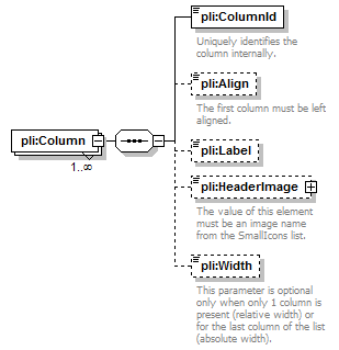 |
||||
| properties |
|
||||
| children | pli:ColumnId pli:Align pli:Label pli:HeaderImage pli:Width |
| type | restriction of xs:string | ||
| facets |
|
||
| annotation |
|
| type | restriction of xs:string | ||||||
| properties |
|
||||||
| facets |
|
||||||
| annotation |
|
| type | extension of xs:string | ||||
| properties |
|
| diagram | 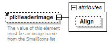 |
||||||||||||
| type | extension of xs:string | ||||||||||||
| properties |
|
||||||||||||
| attributes |
|
||||||||||||
| annotation |
|
| type | restriction of xs:string | ||||
| properties |
|
||||
| facets |
|
| type | xs:unsignedInt | ||||
| properties |
|
||||
| annotation |
|
| diagram | 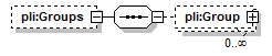 |
||||
| properties |
|
||||
| children | pli:Group |
| diagram | 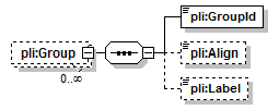 |
||||
| properties |
|
||||
| children | pli:GroupId pli:Align pli:Label |
| type | restriction of xs:string | ||
| facets |
|
| type | restriction of xs:string | ||||||
| properties |
|
||||||
| facets |
|
| type | xs:string | ||||
| properties |
|
| diagram | 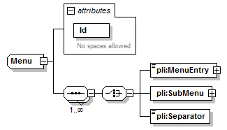 |
||||||||||||||
| children | pli:MenuEntry pli:SubMenu pli:Separator | ||||||||||||||
| used by |
|
||||||||||||||
| attributes |
|
| type | restriction of xs:string | ||
| properties |
|
||
| facets |
|
||
| annotation |
|
| diagram |  |
||||||||||||
| type | extension of xs:string | ||||||||||||
| attributes |
|
| type | restriction of xs:string | ||
| properties |
|
||
| facets |
|
| diagram | 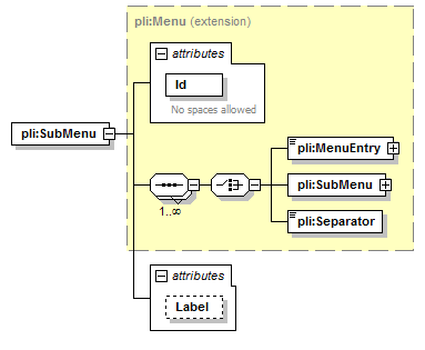 |
||||||||||||||||||||
| type | extension of pli:Menu | ||||||||||||||||||||
| children | pli:MenuEntry pli:SubMenu pli:Separator | ||||||||||||||||||||
| attributes |
|
| type | xs:string |
| diagram | 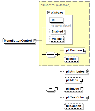 |
||||||||||||||||||||||||||
| type | extension of pli:Control | ||||||||||||||||||||||||||
| properties |
|
||||||||||||||||||||||||||
| children | pli:Position pli:Help pli:Attributes pli:Menu pli:Image pli:TextColor pli:Caption | ||||||||||||||||||||||||||
| attributes |
|
| diagram | 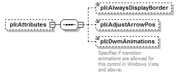 |
||||
| properties |
|
||||
| children | pli:AlwaysDisplayBorder pli:AdjustArrowPos pli:DwmAnimations |
| type | xs:boolean | ||||||
| properties |
|
| type | xs:boolean | ||||||
| properties |
|
| type | restriction of xs:string | ||||||
| properties |
|
||||||
| facets |
|
||||||
| annotation |
|
| diagram | 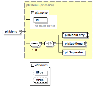 |
||||||||||||||||||||||||||
| type | extension of pli:Menu | ||||||||||||||||||||||||||
| properties |
|
||||||||||||||||||||||||||
| children | pli:MenuEntry pli:SubMenu pli:Separator | ||||||||||||||||||||||||||
| attributes |
|
| type | restriction of xs:string | ||||||||
| properties |
|
||||||||
| facets |
|
| type | restriction of xs:string | ||||
| properties |
|
||||
| facets |
|
| diagram |  |
||||||||||||
| type | extension of pli:Image | ||||||||||||
| properties |
|
||||||||||||
| children | pli:Name pli:Format | ||||||||||||
| attributes |
|
| type | xs:int | ||
| properties |
|
| diagram |  |
||||
| type | pli:Color | ||||
| properties |
|
||||
| children | pli:Red pli:Green pli:Blue pli:Alpha pli:BaseColor pli:GlobalColor |
| type | xs:string | ||||
| properties |
|
| properties |
|
||
| used by |
|
||
| annotation |
|
| diagram |  |
||||||||||||||||||||
| type | extension of pli:Element | ||||||||||||||||||||
| properties |
|
||||||||||||||||||||
| children | pli:Position | ||||||||||||||||||||
| attributes |
|
||||||||||||||||||||
| annotation |
|
| diagram | 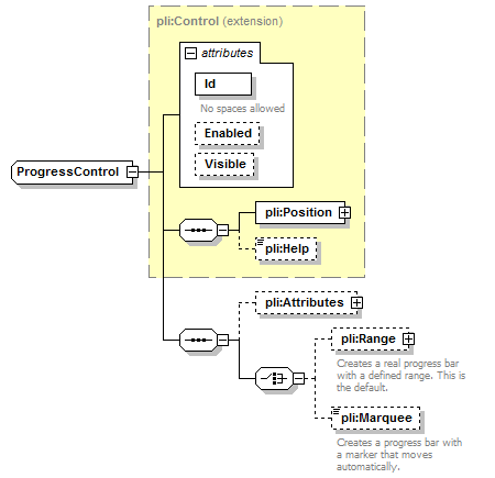 |
||||||||||||||||||||||||||
| type | extension of pli:Control | ||||||||||||||||||||||||||
| properties |
|
||||||||||||||||||||||||||
| children | pli:Position pli:Help pli:Attributes pli:Range pli:Marquee | ||||||||||||||||||||||||||
| attributes |
|
| diagram | 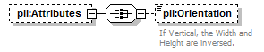 |
||||
| properties |
|
||||
| children | pli:Orientation |
| type | restriction of xs:string | ||||||
| properties |
|
||||||
| facets |
|
||||||
| annotation |
|
| diagram | 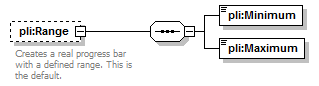 |
||||
| properties |
|
||||
| children | pli:Minimum pli:Maximum | ||||
| annotation |
|
| type | xs:int | ||
| properties |
|
| type | xs:int | ||
| properties |
|
| properties |
|
||||
| annotation |
|
| diagram | 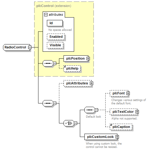 |
||||||||||||||||||||||||||
| type | extension of pli:Control | ||||||||||||||||||||||||||
| properties |
|
||||||||||||||||||||||||||
| children | pli:Position pli:Help pli:Attributes pli:Font pli:TextColor pli:Caption pli:CustomLook | ||||||||||||||||||||||||||
| attributes |
|
| diagram | 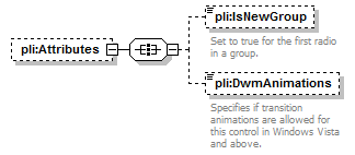 |
||||
| properties |
|
||||
| children | pli:IsNewGroup pli:DwmAnimations |
| type | xs:boolean | ||||||
| properties |
|
||||||
| annotation |
|
| type | restriction of xs:string | ||||||
| properties |
|
||||||
| facets |
|
||||||
| annotation |
|
| diagram | 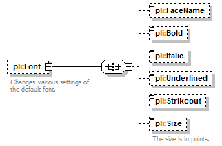 |
||||
| properties |
|
||||
| children | pli:FaceName pli:Bold pli:Italic pli:Underlined pli:Strikeout pli:Size | ||||
| annotation |
|
| type | xs:string | ||||
| properties |
|
| type | xs:boolean | ||||
| properties |
|
| type | xs:boolean | ||||
| properties |
|
| type | xs:boolean | ||||
| properties |
|
| type | xs:boolean | ||||
| properties |
|
| type | xs:double | ||||||
| properties |
|
||||||
| annotation |
|
| diagram |  |
||||
| type | pli:Color | ||||
| properties |
|
||||
| children | pli:Red pli:Green pli:Blue pli:Alpha pli:BaseColor pli:GlobalColor | ||||
| annotation |
|
| type | xs:string | ||||
| properties |
|
| diagram |  |
||
| children | pli:FocusRect pli:Base pli:Normal pli:Hot pli:Pushed pli:Disabled | ||
| annotation |
|
| diagram |  |
||
| children | pli:Left pli:Top pli:Right pli:Bottom | ||
| annotation |
|
| type | xs:int |
| type | xs:int |
| type | xs:int |
| type | xs:int |
| diagram |  |
||||
| properties |
|
||||
| children | pli:Element | ||||
| annotation |
|
| diagram |  |
||||||||||||||||||||
| type | pli:Element | ||||||||||||||||||||
| properties |
|
||||||||||||||||||||
| children | pli:Position | ||||||||||||||||||||
| attributes |
|
| diagram | 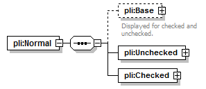 |
| children | pli:Base pli:Unchecked pli:Checked |
| diagram |  |
||||
| properties |
|
||||
| children | pli:Element | ||||
| annotation |
|
| type | pli:Element | ||||||||||||||||||||
| properties |
|
||||||||||||||||||||
| children | pli:Position | ||||||||||||||||||||
| attributes |
|
| diagram |  |
| children | pli:Element |
| type | pli:Element | ||||||||||||||||||||
| properties |
|
||||||||||||||||||||
| children | pli:Position | ||||||||||||||||||||
| attributes |
|
| diagram |  |
| children | pli:Element |
| type | pli:Element | ||||||||||||||||||||
| properties |
|
||||||||||||||||||||
| children | pli:Position | ||||||||||||||||||||
| attributes |
|
| diagram | 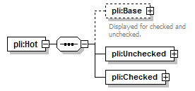 |
| children | pli:Base pli:Unchecked pli:Checked |
| diagram |  |
||||
| properties |
|
||||
| children | pli:Element | ||||
| annotation |
|
| type | pli:Element | ||||||||||||||||||||
| properties |
|
||||||||||||||||||||
| children | pli:Position | ||||||||||||||||||||
| attributes |
|
| diagram |  |
| children | pli:Element |
| type | pli:Element | ||||||||||||||||||||
| properties |
|
||||||||||||||||||||
| children | pli:Position | ||||||||||||||||||||
| attributes |
|
| diagram | 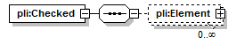 |
| children | pli:Element |
| type | pli:Element | ||||||||||||||||||||
| properties |
|
||||||||||||||||||||
| children | pli:Position | ||||||||||||||||||||
| attributes |
|
| diagram | 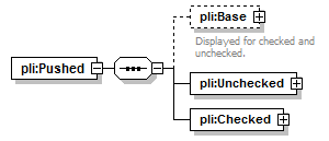 |
| children | pli:Base pli:Unchecked pli:Checked |
| diagram | 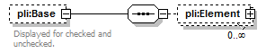 |
||||
| properties |
|
||||
| children | pli:Element | ||||
| annotation |
|
| type | pli:Element | ||||||||||||||||||||
| properties |
|
||||||||||||||||||||
| children | pli:Position | ||||||||||||||||||||
| attributes |
|
| diagram |  |
| children | pli:Element |
| type | pli:Element | ||||||||||||||||||||
| properties |
|
||||||||||||||||||||
| children | pli:Position | ||||||||||||||||||||
| attributes |
|
| diagram |  |
| children | pli:Element |
| type | pli:Element | ||||||||||||||||||||
| properties |
|
||||||||||||||||||||
| children | pli:Position | ||||||||||||||||||||
| attributes |
|
| diagram | 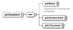 |
||||
| properties |
|
||||
| children | pli:Base pli:Unchecked pli:Checked |
| diagram |  |
||||
| properties |
|
||||
| children | pli:Element | ||||
| annotation |
|
| type | pli:Element | ||||||||||||||||||||
| properties |
|
||||||||||||||||||||
| children | pli:Position | ||||||||||||||||||||
| attributes |
|
| diagram | 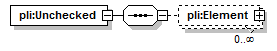 |
| children | pli:Element |
| type | pli:Element | ||||||||||||||||||||
| properties |
|
||||||||||||||||||||
| children | pli:Position | ||||||||||||||||||||
| attributes |
|
| diagram |  |
| children | pli:Element |
| type | pli:Element | ||||||||||||||||||||
| properties |
|
||||||||||||||||||||
| children | pli:Position | ||||||||||||||||||||
| attributes |
|
| diagram | 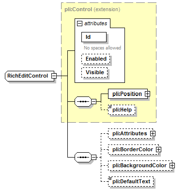 |
||||||||||||||||||||||||||
| type | extension of pli:Control | ||||||||||||||||||||||||||
| properties |
|
||||||||||||||||||||||||||
| children | pli:Position pli:Help pli:Attributes pli:BorderColor pli:BackgroundColor pli:DefaultText | ||||||||||||||||||||||||||
| attributes |
|
| diagram | 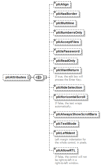 |
||||
| properties |
|
||||
| children | pli:Align pli:HasBorder pli:Multiline pli:NumbersOnly pli:AcceptFiles pli:IsPassword pli:ReadOnly pli:WantReturn pli:HideSelection pli:HorizontalScroll pli:AlwaysShowScrollBars pli:TextMode pli:LeftIdent pli:AllowRTL |
| type | restriction of xs:string | ||||||
| properties |
|
||||||
| facets |
|
| type | xs:boolean | ||||||
| properties |
|
| type | xs:boolean | ||||||
| properties |
|
| type | xs:boolean | ||||||
| properties |
|
| type | xs:boolean | ||||||
| properties |
|
| type | xs:boolean | ||||||
| properties |
|
| type | xs:boolean | ||||||
| properties |
|
| type | xs:boolean | ||||||
| properties |
|
||||||
| annotation |
|
| type | xs:boolean | ||||||
| properties |
|
| type | xs:boolean | ||||||
| properties |
|
||||||
| annotation |
|
| type | xs:boolean | ||||||
| properties |
|
| type | restriction of xs:string | ||||||
| properties |
|
||||||
| facets |
|
| type | xs:unsignedInt | ||||||
| properties |
|
||||||
| annotation |
|
| type | xs:boolean | ||||||
| properties |
|
||||||
| annotation |
|
| diagram |  |
||||
| type | pli:Color | ||||
| properties |
|
||||
| children | pli:Red pli:Green pli:Blue pli:Alpha pli:BaseColor pli:GlobalColor |
| type | pli:Color | ||||
| properties |
|
||||
| children | pli:Red pli:Green pli:Blue pli:Alpha pli:BaseColor pli:GlobalColor |
| type | xs:string | ||||
| properties |
|
| diagram |  |
||||||||||||||||||||||||||
| type | extension of pli:Control | ||||||||||||||||||||||||||
| properties |
|
||||||||||||||||||||||||||
| children | pli:Position pli:Help pli:Attributes pli:Color pli:BackgroundColor pli:Font pli:Caption | ||||||||||||||||||||||||||
| attributes |
|
||||||||||||||||||||||||||
| annotation |
|
| diagram | 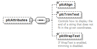 |
||||
| properties |
|
||||
| children | pli:Align pli:TrimText pli:WrapText |
| type | restriction of xs:string | ||||||
| properties |
|
||||||
| facets |
|
| type | xs:boolean | ||||||
| properties |
|
||||||
| annotation |
|
| type | xs:boolean | ||||||
| properties |
|
||||||
| annotation |
|
| diagram | 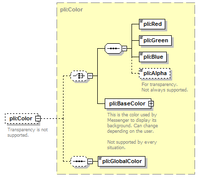 |
||||
| type | pli:Color | ||||
| properties |
|
||||
| children | pli:Red pli:Green pli:Blue pli:Alpha pli:BaseColor pli:GlobalColor | ||||
| annotation |
|
| type | pli:Color | ||||
| properties |
|
||||
| children | pli:Red pli:Green pli:Blue pli:Alpha pli:BaseColor pli:GlobalColor |
| diagram | 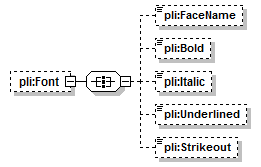 |
||||
| properties |
|
||||
| children | pli:FaceName pli:Bold pli:Italic pli:Underlined pli:Strikeout |
| type | xs:string | ||||
| properties |
|
| type | xs:boolean | ||||
| properties |
|
| type | xs:boolean | ||||
| properties |
|
| type | xs:boolean | ||||
| properties |
|
| type | xs:boolean | ||||
| properties |
|
| type | xs:string | ||||
| properties |
|
| diagram | 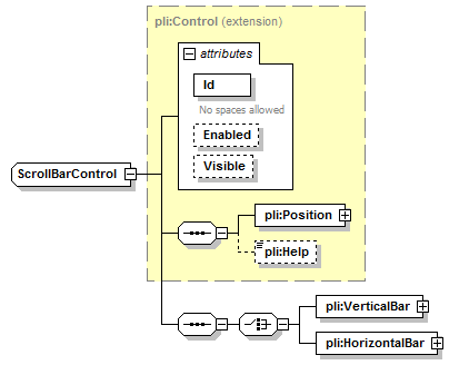 |
||||||||||||||||||||||||||
| type | extension of pli:Control | ||||||||||||||||||||||||||
| properties |
|
||||||||||||||||||||||||||
| children | pli:Position pli:Help pli:VerticalBar pli:HorizontalBar | ||||||||||||||||||||||||||
| attributes |
|
| diagram | 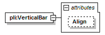 |
||||||||||||
| attributes |
|
| type | restriction of xs:string | ||||
| properties |
|
||||
| facets |
|
| diagram | 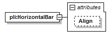 |
||||||||||||
| attributes |
|
| type | restriction of xs:string | ||||
| properties |
|
||||
| facets |
|
| diagram | 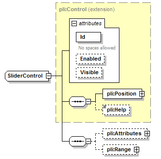 |
||||||||||||||||||||||||||
| type | extension of pli:Control | ||||||||||||||||||||||||||
| properties |
|
||||||||||||||||||||||||||
| children | pli:Position pli:Help pli:Attributes pli:Range | ||||||||||||||||||||||||||
| attributes |
|
| diagram | 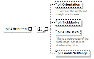 |
||||
| properties |
|
||||
| children | pli:Orientation pli:TickMarks pli:AutoTicks pli:EnableSelRange |
| type | restriction of xs:string | ||||||
| properties |
|
||||||
| facets |
|
||||||
| annotation |
|
| type | restriction of xs:string | ||||||
| properties |
|
||||||
| facets |
|
| type | restriction of xs:unsignedByte | ||||||
| properties |
|
||||||
| facets |
|
||||||
| annotation |
|
| type | xs:boolean | ||||||
| properties |
|
| diagram |  |
||||
| properties |
|
||||
| children | pli:Minimum pli:Maximum |
| type | xs:int | ||
| properties |
|
| type | xs:int | ||
| properties |
|
| diagram | 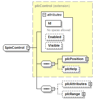 |
||||||||||||||||||||||||||
| type | extension of pli:Control | ||||||||||||||||||||||||||
| properties |
|
||||||||||||||||||||||||||
| children | pli:Position pli:Help pli:Attributes pli:Range | ||||||||||||||||||||||||||
| attributes |
|
| diagram | 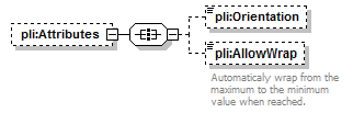 |
||||
| properties |
|
||||
| children | pli:Orientation pli:AllowWrap |
| type | restriction of xs:string | ||||||
| properties |
|
||||||
| facets |
|
| type | xs:boolean | ||||||
| properties |
|
||||||
| annotation |
|
| diagram | 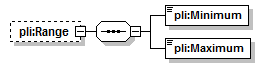 |
||||
| properties |
|
||||
| children | pli:Minimum pli:Maximum |
| type | xs:int |
| type | xs:int |
| diagram | 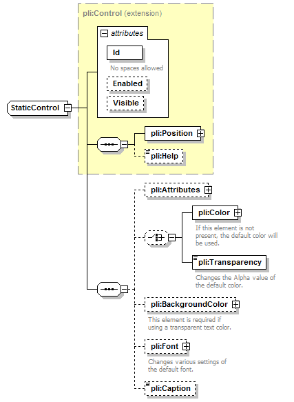 |
||||||||||||||||||||||||||
| type | extension of pli:Control | ||||||||||||||||||||||||||
| properties |
|
||||||||||||||||||||||||||
| children | pli:Position pli:Help pli:Attributes pli:Color pli:Transparency pli:BackgroundColor pli:Font pli:Caption | ||||||||||||||||||||||||||
| attributes |
|
| diagram |  |
||||
| properties |
|
||||
| children | pli:Align pli:AlignRTL pli:VAlign pli:Trimming pli:WrapText pli:AutoAdjustWidth |
| type | restriction of xs:string | ||||||
| properties |
|
||||||
| facets |
|
| type | restriction of xs:string | ||||||
| properties |
|
||||||
| facets |
|
||||||
| annotation |
|
| type | restriction of xs:string | ||||||
| properties |
|
||||||
| facets |
|
| type | restriction of xs:string | ||||||||||
| properties |
|
||||||||||
| facets |
|
||||||||||
| annotation |
|
| type | xs:boolean | ||||||
| properties |
|
| type | xs:boolean | ||||||
| properties |
|
||||||
| annotation |
|
| diagram | 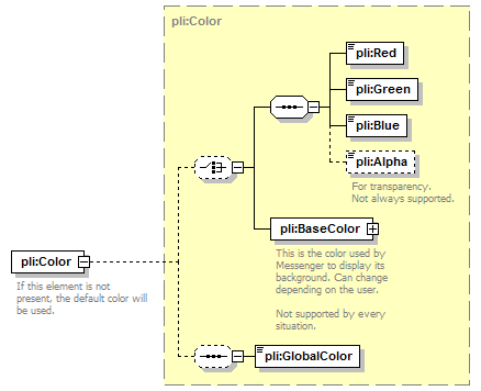 |
||
| type | pli:Color | ||
| children | pli:Red pli:Green pli:Blue pli:Alpha pli:BaseColor pli:GlobalColor | ||
| annotation |
|
| type | restriction of xs:unsignedInt | ||||
| properties |
|
||||
| facets |
|
||||
| annotation |
|
| type | pli:Color | ||||
| properties |
|
||||
| children | pli:Red pli:Green pli:Blue pli:Alpha pli:BaseColor pli:GlobalColor | ||||
| annotation |
|
| diagram |  |
||||
| properties |
|
||||
| children | pli:FaceName pli:Bold pli:Italic pli:Underlined pli:Strikeout pli:Size | ||||
| annotation |
|
| type | xs:string | ||||
| properties |
|
| type | xs:boolean | ||||
| properties |
|
| type | xs:boolean | ||||
| properties |
|
| type | xs:boolean | ||||
| properties |
|
| type | xs:boolean | ||||
| properties |
|
| type | xs:double | ||||||
| properties |
|
||||||
| annotation |
|
| type | xs:string | ||||
| properties |
|
| diagram | 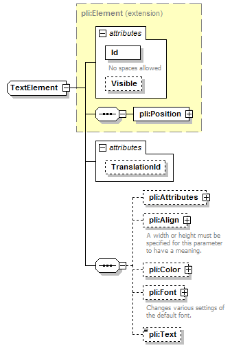 |
||||||||||||||||||||||||||
| type | extension of pli:Element | ||||||||||||||||||||||||||
| properties |
|
||||||||||||||||||||||||||
| children | pli:Position pli:Attributes pli:Align pli:Color pli:Font pli:Text | ||||||||||||||||||||||||||
| attributes |
|
| diagram | 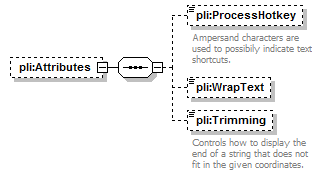 |
||||
| properties |
|
||||
| children | pli:ProcessHotkey pli:WrapText pli:Trimming |
| type | xs:boolean | ||||||
| properties |
|
||||||
| annotation |
|
| type | xs:boolean | ||||||
| properties |
|
| type | restriction of xs:string | ||||||||||
| properties |
|
||||||||||
| facets |
|
||||||||||
| annotation |
|
| diagram | 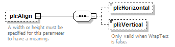 |
||||
| properties |
|
||||
| children | pli:Horizontal pli:Vertical | ||||
| annotation |
|
| type | restriction of xs:string | ||||||
| properties |
|
||||||
| facets |
|
| type | restriction of xs:string | ||||||
| properties |
|
||||||
| facets |
|
||||||
| annotation |
|
| diagram |  |
||||
| type | pli:Color | ||||
| properties |
|
||||
| children | pli:Red pli:Green pli:Blue pli:Alpha pli:BaseColor pli:GlobalColor |
| diagram |  |
||||
| properties |
|
||||
| children | pli:FaceName pli:Bold pli:Italic pli:Underlined pli:Strikeout pli:Size | ||||
| annotation |
|
| type | xs:string | ||||
| properties |
|
| type | xs:boolean | ||||
| properties |
|
| type | xs:boolean | ||||
| properties |
|
| type | xs:boolean | ||||
| properties |
|
| type | xs:boolean | ||||
| properties |
|
| type | xs:double | ||||||
| properties |
|
||||||
| annotation |
|
| properties |
|
| diagram | 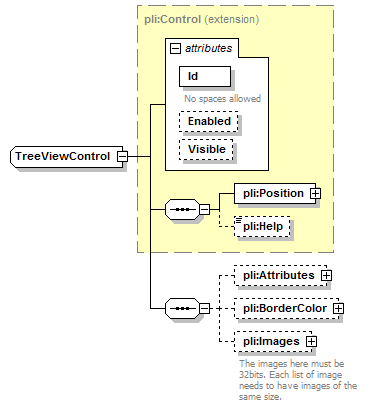 |
||||||||||||||||||||||||||
| type | extension of pli:Control | ||||||||||||||||||||||||||
| properties |
|
||||||||||||||||||||||||||
| children | pli:Position pli:Help pli:Attributes pli:BorderColor pli:Images | ||||||||||||||||||||||||||
| attributes |
|
| diagram | 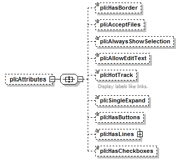 |
||||
| properties |
|
||||
| children | pli:HasBorder pli:AcceptFiles pli:AlwaysShowSelection pli:AllowEditText pli:HotTrack pli:SingleExpand pli:HasButtons pli:HasLines pli:HasCheckboxes |
| type | xs:boolean | ||||||
| properties |
|
| type | xs:boolean | ||||||
| properties |
|
| type | xs:boolean | ||||||
| properties |
|
| type | xs:boolean | ||||||
| properties |
|
| type | extension of xs:boolean | ||||||
| properties |
|
||||||
| annotation |
|
| type | xs:boolean | ||||||
| properties |
|
| type | xs:boolean | ||||||
| properties |
|
| diagram | 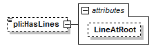 |
||||||||||||
| type | extension of xs:boolean | ||||||||||||
| properties |
|
||||||||||||
| attributes |
|
| type | xs:boolean | ||
| properties |
|
| type | xs:boolean | ||||||
| properties |
|
| diagram |  |
||||
| type | pli:Color | ||||
| properties |
|
||||
| children | pli:Red pli:Green pli:Blue pli:Alpha pli:BaseColor pli:GlobalColor |
| diagram | 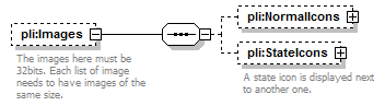 |
||||
| properties |
|
||||
| children | pli:NormalIcons pli:StateIcons | ||||
| annotation |
|
| diagram | 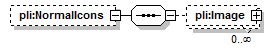 |
||||
| properties |
|
||||
| children | pli:Image |
| diagram |  |
||||||||||||||||||||
| type | extension of pli:Image | ||||||||||||||||||||
| properties |
|
||||||||||||||||||||
| children | pli:Name pli:Format | ||||||||||||||||||||
| attributes |
|
| type | xs:string | ||
| properties |
|
| type | xs:boolean | ||
| properties |
|
||
| annotation |
|
| diagram |  |
||||
| properties |
|
||||
| children | pli:Image | ||||
| annotation |
|
| diagram |  |
||||||||||||
| type | extension of pli:Image | ||||||||||||
| properties |
|
||||||||||||
| children | pli:Name pli:Format | ||||||||||||
| attributes |
|
| type | xs:string | ||
| properties |
|
| diagram | 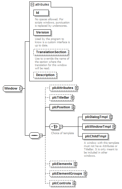 |
||||||||||||||||||||||||||||||||||||
| children | pli:Attributes pli:TitleBar pli:Position pli:DialogTmpl pli:WindowTmpl pli:ChildTmpl pli:Elements pli:ElementGroups pli:Controls | ||||||||||||||||||||||||||||||||||||
| used by |
|
||||||||||||||||||||||||||||||||||||
| attributes |
|
| type | restriction of xs:string | ||
| properties |
|
||
| facets |
|
||
| annotation |
|
| type | xs:unsignedInt | ||
| properties |
|
||
| annotation |
|
| type | xs:string | ||
| annotation |
|
| type | xs:string |
| diagram | 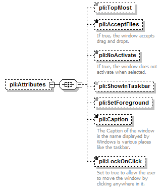 |
||||
| properties |
|
||||
| children | pli:TopMost pli:AcceptFiles pli:NoActivate pli:ShowInTaskbar pli:SetForeground pli:Caption pli:LockOnClick |
| type | xs:boolean | ||||||
| properties |
|
| type | xs:boolean | ||||||
| properties |
|
||||||
| annotation |
|
| type | xs:boolean | ||||||
| properties |
|
||||||
| annotation |
|
| type | xs:boolean | ||||||
| properties |
|
| type | xs:boolean | ||||||
| properties |
|
| type | xs:string | ||||
| properties |
|
||||
| annotation |
|
| type | xs:boolean | ||||||
| properties |
|
||||||
| annotation |
|
| diagram | 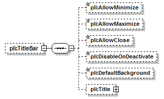 |
||||
| properties |
|
||||
| children | pli:AllowMinimize pli:AllowMaximize pli:AllowClose pli:DisableOnDeactivate pli:DefaultBackground pli:Title |
| type | xs:boolean | ||||||
| properties |
|
| type | xs:boolean | ||||||
| properties |
|
| type | xs:boolean | ||||||
| properties |
|
| type | xs:boolean | ||||||
| properties |
|
| type | xs:boolean | ||||||
| properties |
|
| diagram | 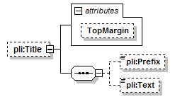 |
||||||||||||
| properties |
|
||||||||||||
| children | pli:Prefix pli:Text | ||||||||||||
| attributes |
|
| type | xs:int | ||
| properties |
|
| type | restriction of xs:string | ||||||||||
| properties |
|
||||||||||
| facets |
|
| type | xs:string | ||||
| properties |
|
| diagram | 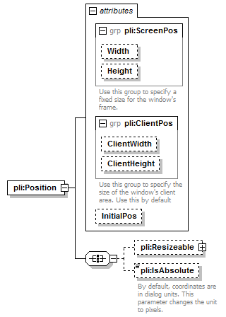 |
||||||||||||||||||||||||||||||||||||
| children | pli:Resizeable pli:IsAbsolute | ||||||||||||||||||||||||||||||||||||
| attributes |
|
| type | restriction of xs:string | ||||||||||||
| properties |
|
||||||||||||
| facets |
|
| diagram | 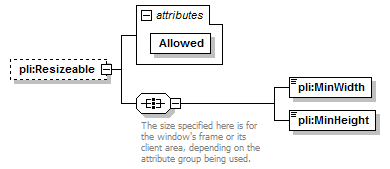 |
||||||||||||
| properties |
|
||||||||||||
| children | pli:MinWidth pli:MinHeight | ||||||||||||
| attributes |
|
| type | restriction of xs:string | ||||||||
| properties |
|
||||||||
| facets |
|
| type | restriction of xs:unsignedInt | ||
| facets |
|
| type | restriction of xs:unsignedInt | ||
| facets |
|
| type | xs:boolean | ||||||
| properties |
|
||||||
| annotation |
|
| diagram | 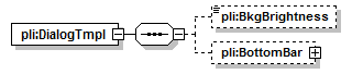 |
| children | pli:BkgBrightness pli:BottomBar |
| type | restriction of xs:string | ||||||
| properties |
|
||||||
| facets |
|
| diagram | 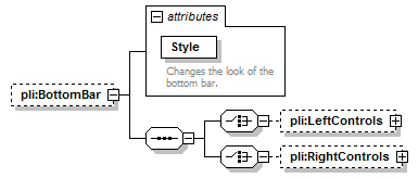 |
||||||||||||||
| properties |
|
||||||||||||||
| children | pli:LeftControls pli:RightControls | ||||||||||||||
| attributes |
|
| type | restriction of xs:string | ||||||||
| properties |
|
||||||||
| facets |
|
||||||||
| annotation |
|
| diagram |  |
||||
| properties |
|
||||
| children | pli:Margin pli:Control |
| type | xs:unsignedInt | ||||||
| properties |
|
||||||
| annotation |
|
| diagram |  |
||||||||||||||||||||||||||
| type | pli:Control | ||||||||||||||||||||||||||
| children | pli:Position pli:Help | ||||||||||||||||||||||||||
| attributes |
|
| diagram | 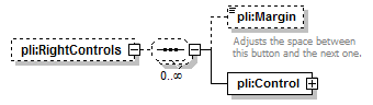 |
||||
| properties |
|
||||
| children | pli:Margin pli:Control |
| type | xs:unsignedInt | ||||||
| properties |
|
||||||
| annotation |
|
| diagram | 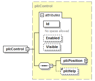 |
||||||||||||||||||||||||||
| type | pli:Control | ||||||||||||||||||||||||||
| children | pli:Position pli:Help | ||||||||||||||||||||||||||
| attributes |
|
| diagram | 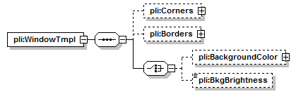 |
| children | pli:Corners pli:Borders pli:BackgroundColor pli:BkgBrightness |
| diagram | 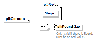 |
||||||||||||
| properties |
|
||||||||||||
| children | pli:RoundSize | ||||||||||||
| attributes |
|
| type | restriction of xs:string | ||||
| properties |
|
||||
| facets |
|
| type | restriction of xs:unsignedInt | ||||||
| properties |
|
||||||
| facets |
|
||||||
| annotation |
|
| diagram | 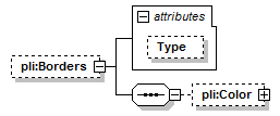 |
||||||||||||
| properties |
|
||||||||||||
| children | pli:Color | ||||||||||||
| attributes |
|
| type | restriction of xs:string | ||||||||
| properties |
|
||||||||
| facets |
|
| diagram | 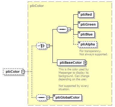 |
||||
| type | pli:Color | ||||
| properties |
|
||||
| children | pli:Red pli:Green pli:Blue pli:Alpha pli:BaseColor pli:GlobalColor |
| type | extension of pli:Color | ||||
| properties |
|
||||
| children | pli:Red pli:Green pli:Blue pli:Alpha pli:BaseColor pli:GlobalColor |
| type | restriction of xs:string | ||||||
| properties |
|
||||||
| facets |
|
| annotation |
|
| diagram | 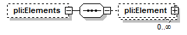 |
||||
| properties |
|
||||
| children | pli:Element |
| diagram | 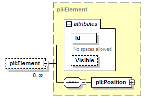 |
||||||||||||||||||||
| type | pli:Element | ||||||||||||||||||||
| properties |
|
||||||||||||||||||||
| children | pli:Position | ||||||||||||||||||||
| attributes |
|
| diagram | 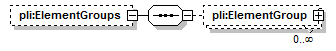 |
||||
| properties |
|
||||
| children | pli:ElementGroup |
| diagram |  |
||||||||||||||||||||
| type | pli:ElementGroup | ||||||||||||||||||||
| properties |
|
||||||||||||||||||||
| children | pli:Position pli:Transparency pli:Elements | ||||||||||||||||||||
| attributes |
|
| diagram | 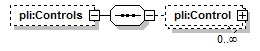 |
||||
| properties |
|
||||
| children | pli:Control |
| diagram |  |
||||||||||||||||||||||||||
| type | pli:Control | ||||||||||||||||||||||||||
| properties |
|
||||||||||||||||||||||||||
| children | pli:Position pli:Help | ||||||||||||||||||||||||||
| attributes |
|
| used by |
|
||||||||||||||||||
| attributes |
|
||||||||||||||||||
| annotation |
|
| used by |
|
||||||||||||||||||
| attributes |
|
||||||||||||||||||
| annotation |
|