God is in the Gaps April 18, 2020
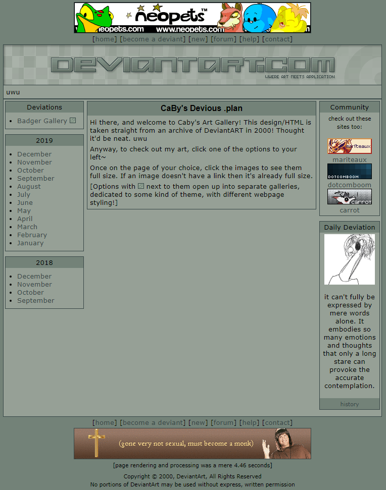
So I wasn’t expecting to do another old website cleanup project…really ever, but especially not so soon after the last. But Caby’s been putting her site back together and stressing over it something chronic :<, so I decided to help make things a little easier for her by overhauling her old art gallery.

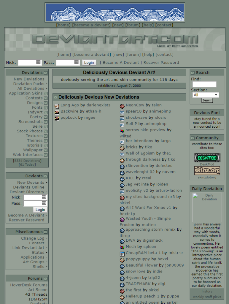
You see, for a while, she used the very old, circa 2000 DeviantART site layout for her gallery. If you remember from the post I just made on cleaning up MP3.com’s layout, sites from that era weren’t exactly keen on the most readable, clean, and functional markup. Even ignoring the total lack of stylesheet, DeviantART, as a way to get around the either bad support or no support for margin control at the time, nested metric shittons of tables and just abused the cellpadding attribute to get so-called “margins”.
<table border="0" cellspacing="0" width="98%" align="center">
<tbody>
<tr bgcolor="#374646">
<td>
<table border="0" cellpadding="3" cellspacing="0" width="100%">
<tr bgcolor="#738278">
<td class="large" align="center">CaBy's Devious .plan</td>
</tr>
<tr bgcolor="#96A096">
<td>
<p align="left">
Login: CaBy<br>
Last Login: -secret-<br>
Last Host: <br>
</p>
</td>
</tr>
</table>
</td>
</tr>
</tbody>
</table>
This isn’t even the most unreadable bit, that’s the worst part. In case you’re wondering why Caby got behind on gallery entries, it’s not because she’s lazy. It’s because this genuinely fucking blows to work with. Either way, there’s no one more qualified to turn that abortion into a usable web page than I am, so I got to work.
Unlike with MP3.com, DeviantART actually had some semblance of a stylesheet. Seeing as her site is already HTTPS-only and uses copious amounts of PNGs (thus having absolutely no chance of working on period-appropriate browsers anyway), I decided to go all-in on making this as “modern” as possible without totally rebuilding the mess of tables. I debated going with a flexbox layout, but that would’ve constituted pretty much a total reimplementation and I just decided it wasn’t really authentic or worth it.
I started with doing a lot of indenting and moving attributes into the stylesheet where possible, which helped a lot as far as readability was concerned. I also killed a lot of the nested tables that were pretty clearly just in there for the aforementioned “margin” usage, and I also shrunk the unwieldy stylesheet that was already there down using more modern selectors. So far so good, this was going well.
Of course, a couple hours into the cleanup, around 1:30 last night, I hit an absolutely dreadful layout bug, one that had separately affected Caby’s site proper and damn near made us give up as web developers:

To explain what that gap is…we don’t know. You’ll have a container, either one rendering as block or as table-cell, with only an image in it. The container and image are set to the same height. Then, despite the container having absolutely no padding to speak of, an extra three pixels get added to the container height under the image, causing a visible gap, and the height property no longer does anything. It’s diabolical, and it happens both in Blink and Goanna browsers, so it’s no lowly glitch.
I diligently pursued every avenue that could cause a few pixels to go amiss. I’ve had anchor elements have their own width and padding before, so I got rid of that, no dice. I then replaced the image with text to see if that was also affected. The gap was gone. I made the container totally empty and set a height on it. I could get it 80 pixels tall exactly. As far as the image was concerned though, the container was 83 pixels.
The only fix I could give Caby at the time was to set a negative margin-bottom value to close the gap, and while that “fixed” it, it only killed the gap on screens scaled to 100%. She had hers at 125%, so the gap persisted. This is where the story would’ve ended, had I not given up and Googled “unremovable gap between elements html table cell” and got this Stack Overflow thread.
It looks like the DOCTYPE is causing the image to display as an inline element. If I add
display: blockto the image, problem solved.

Motherfucker.
So…despite inline elements (like images) having no margin value to speak of, the fact that they display as inline…causes a margin.
I don’t have the 1,200 IQ required to understand this.
Either way, fixed, thanks God. Aside from that though, the cleanup actually went really well. It’s not pixel perfect to the original, but the setup is a lot more sensical and the markup is infinitely more readable. Here’s a lightning round of everything else I fixed, tuned up, or polished:
- Split out the stylesheet from an internal one in the page head to an external one for cleanliness
- Set an actual character encoding so the copyright symbol in the footer displays properly
- Restored the full-sized versions of a few pieces from the gallery that had to be shrunk down to fit on the page (this being especially bad with the crisp pixely works >_>)
- Replaced the old,
document.write()-based randomizer script that joppie, the talentless hack, hacked together for Caby ages ago with the one on somnolescent.net, thus making sure they share the same batch of banner ads and don’t need to be separately updated - Gave everything a ton more room to breathe, setting some margins on the images and using paragraph elements a lot more frequently
- Wrote a cute little script that replaces the “this page was generated in [x] seconds” number at the bottom with a completely random, useless number
- Overhauled the navigation on the main gallery index so each year is split into separate boxes
- And of course, made it all AutoSite-based so the gallery fits snugly into Caby’s existing AutoSite project and she can make new pages without touching the still vaguely unwieldy markup (just the nature of table layouts umu)

I am incredibly pleased with how this turned out. This kinda project has the tendency to run you into odd, obscure glitches you’ve never even seen before and never want to see again afterwards. Same with somnolescent.net, really; I don’t really do these kinds of tight, no padding, pixel-exact layouts, and I find they tend to be just as hacky. In both cases, though, they turned out absolutely excellent.
Me personally, I’m just hype to see more gallery pages from her. There’s always at least one piece on there I haven’t even seen before, and new Caby art, even just new to me? Is fucking hype.
Tags: DeviantART, Web Design,
Hosted by DreamHost. mini.css so gracefully developed by @Chalarangelo, bless em.