Hunkering Down March 17, 2020
Well, with the world absolutely shutting the fuck down, I suddenly feel really productive, and I mean really. Thinking about my stories, my sites, my music, my custom disc, everything I wanna build…and now, I have two weeks from my encroaching real life to hide and get on it, so here goes.
Starting with a personal site refresh to ease me back into it, mostly just stripping stuff down. I’ve become dissatisfied with my current site in a couple of ways:
- Too thin a layout. 800px isn’t even close to enough for a decently-wide table, and I’m just kinda over it being centered and textured with a bunch of crap in the background anyway.
- My FLAC album downloads are taking up almost half the space of Somnol’s backup DVD-Rs. Yes, even though they’re dual-layer. I’m moving the lossless downloads to Bandcamp instead.
- No nav, except at the bottom of each page. Kinda clunky.
- Minor thing, but a new friend pointed out that he didn’t even know Somnolescent was still a thing because our sites weren’t dated and looked rather old. Point taken, dcb added a
[#modified#]tag in the nightly build of AutoSite and I’m making use of it on every page. - A lot of hacks and AutoSite conditionals have made the markup very, very messy. The footer icons, disregarding the fact that I hate the way they came out, are a ton of work to maintain every time I wanna add a new link.
- Just plain wanna start fresh. Something easier to manage.
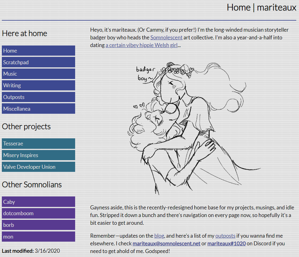
Since Caby recently overhauled her site to clean it up, I figured this was a good time to clean up mine. Here’s what I’ve got thusfar:

Still an early WIP obviously, but I’m actually not sure how much of this I wanna add onto. I like it a lot already. I wanted to keep a little Aqua in there, mostly in those stripes, though I nixed Charcoal (the Mac OS 8 font) for Lato as far as fonts go. Charcoal doesn’t have native boldface glyphs (none of the System fonts do), and it causes annoying “doubled” rendering errors on iOS, possibly elsewhere.
(In one of my traditional classic ironic twists, I can’t actually find a place where this is happening on any of my sites, nor a good screenshot, but CSS-Tricks is here to prove that I’m not just making shit up.)
I can fix this with my meager knowledge of FontForge, but I lack the patience to sit there, making sure strokes go the right way and keeping stuff from looking uneven anyway. Vectors aren’t my friend. Plus, I just think thin fonts go better with off-whites. It’s a very clean look, and that’s what I’m going for. All the busy, complicated layouts, I save for my actual projects. For my personal site? Downright minimal.
Tags:
Hosted by DreamHost. mini.css so gracefully developed by @Chalarangelo, bless em.