“Sunrise”, and The Search for a New Body Font
- Posted by mariteaux on June 19th, 2020 filed in Writing
- Comment now »
I should’ve taken the slow glow back to green eyes as a sign that she could tell something was wrong. I don’t know, were we friends? Was she not just being nice to me? Would she not have rambled about her documentaries and postcards to anyone else?
I slumped into my lap, looking away again. “She probably has other friends—online or something, and we’ve only talked, like, twice, and I’m sure she was just being polite because she’s—well, polite.”
“…I think she’s fond of you, Sebastian.”
Gah. Somehow, her encouragement stabbed more than her nagging. Every time I imagined it, the thought stressed me out. Why me?
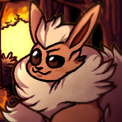
Yes, at long last, I have posted new writing. Think the last time I did was when I squeaked out a few things for my anniversary, but this time, it’s stuff everyone can enjoy–Pennyverse! It’s called “Back to the Sunrise”, and despite it being named for a Folk Implosion song, it was actually inspired by a Slowdive song, so go figure. Seb and the Guardian enjoying a bit of uneasy company together early one morning. Nothing huge, but a nice way to start again. I still have a Gonzo story to finish, that’ll be a bit more interesting.
This one comes accompanied by a site tweak I’ve been looking to make for a little while now: replacing my writing font. For a bit of history, with System 7, Apple started replacing their trademark bitmap fonts with redrawn vector versions. The benefit to a vector (Postscript, TrueType, OpenType, etc) font over a bitmap font is that a vector font scales a lot nicer at any size, at the cost of being more annoying to develop. (If caring about stroke directions and hinting sounds like your thing, go into typography. I couldn’t.)
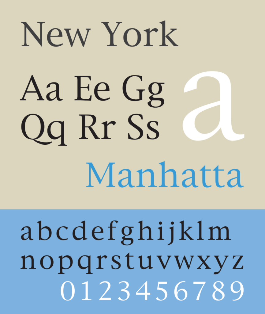
One font to make the jump was a serif font called New York. As far as serif fonts go, it’s a rather nice and underappreciated one, coming off a bit more classy and a bit less stuffy than something like, say, Times to me. Since I was using it in Mac Word to write the stories, I felt it’d be appropriate to have them read in the same font. Extracting a Classic Mac OS font isn’t terribly difficult; crack open the system suitcase, grab the file, and convert it to TTF or OTF using a program like FontForge. (Or, if you’re using it online, WOFF2.)
Of course, here’s the problem with it: those vectors were originally meant for print usage, not screen usage. Let’s talk about DPI for a moment. DPI is “dots per inch”, a rough metric of how sharp a display, scan, or printout is. High DPI displays are certainly nothing that new these days, but it’s still fairly common to find displays that only have around 100 dots per inch. (My non-Retina iMac has a DPI of around 109.) Even cheap printers these days can print upwards of 600 dots per inch, and a laser printer on high can go in the thousands. As you can well imagine, the same font is much sharper on paper than it is on the screen, and this makes all the difference depending on your font.
This doesn’t come across too well on that specimen up there, but New York has fairly thin strokes. On paper, where you have a lot more resolution to work with, this is likely fine (I haven’t printed New York to try it out, admittedly), but onscreen, where it feels like reading through a screen door, it gets a little soft. (This goes in the opposite direction too: a font like Georgia translates well onscreen thanks to its heavy strokes, but some people autistically screech if you use it on paper.)
It’s not to say New York necessarily looks bad, especially at larger sizes or on a higher DPI display, but on my screen, through my eyes, it wasn’t cutting it as a body font. Not to mention the lack of bold or italic font faces, which means the software kinda has to make it up as it goes along, to varying results.
Compounding the switch is that I’m no longer using Mac Word to write. I still love how chunky it looks and how efficient it is compared to modern Word, but it never felt anything less than cramped and the file formats it outputs are very much a sign of early 90s Classic Mac OS. About the only thing it’ll output that anything other than a full-blown copy of Word will take is RTF and plain text, and even its RTF files make Wordpad hang on occasion.
Right now, I’ve been enjoying Works 6.0. It’s still a lot lighter than Word, but the layout is more comfortable and it’ll write to RTF and far more modern DOC formats without issue. There, I use Georgia, and while I do have Georgia in my site’s font stack, I thought I’d go hunting through some open-source fonts first before I made it my main choice.

In the end, I decided on Bitstream Charter. Charter is an earlier font by Matthew Carter, the same guy who designed Georgia and Verdana. It’s got the same flavor as New York, but it’s a lot stronger and a lot simpler of a design. It’s more meant as a body font for low resolution displays–originally, that meant fax machines and dot-matrix printers, amazingly. It’s also a properly open source font, so unlike New York, I’m not technically redistributing proprietary stuff. (Not that Apple would care or anything, given that New York hasn’t been packed in since OS 9 and I’m nobody, but hey, open source fonts are cool.)
In any case, my plan now is to dedicate at least the next few months, if not the rest of the year, to my writing. I’ve been neglecting it, and I feel like I’ve broken through a lot mentally since the last time I took a serious crack at it. I mean, this was written in a day pretty much on a whim, and I miss that. I’ve also just started a lot of stories that need an ending. Content is coming, promise.
As I hinted at in my last post, there’s some work being done behind the scenes. A lot of my attention this month has gone towards a big, self-indulgent Minecraft build between Caby and I–a lot of lads popping up out of the blue, sort of what Calelira could’ve been had Brianna not, you know, abused me at a young age and all. Especially given that that’s gonna get shuttered at some point this year (but that’s another post), it’s nice to have some outlet for all the swords and plants and overly fluffy animal people in my head again.
The other bit involves a friend in a…certain community I used to be a part of who recently popped up to offer a collaboration opportunity. That’s gonna be an interesting story to tell.