The Great Somnolescent Table Takeover
- Posted by mariteaux on July 3rd, 2020 filed in Technologizing
- Comment now »
You know, some months I don’t write anything on here for weeks on end. Other months, I apparently have too much to talk about in a single day and I’m back to rambling daily on here.
Something that’s been on my mind a lot is mobile support vs old browser support. Nearly all the sites on our network have been at least mobile-friendly, if not mobile-optimized, and that’s come at the expense of supporting older browsers. This is partly my own doing: I tend to build the mobile site first and use a media query to overlay the desktop stylesheet on top; of course browsers without CSS3 support don’t load this second stylesheet, or at least don’t recognize the way I’m trying to load it. (And even if they do load it, I tend to rely on CSS Grid for my layouts (which is still great and I’d still use it if I was building a site as portfolio work or something), and Grid’s so recent that some modern browsers still have issues with it, let alone older ones.) Point is, everything looks broken by default.
And really, what point is there to mobile optimization? It’s nice not having to zoom in, I guess, but browsing on a phone is still utter garbage. It stopped being worth it to Caby, who almost got turned off completely to sitebuilding because of this constant need to optimize things into a tower for ease of idly scrolling through on a tiny phone. She’s since gone back to table layouts. Can’t say I blame her.

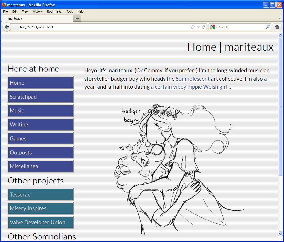
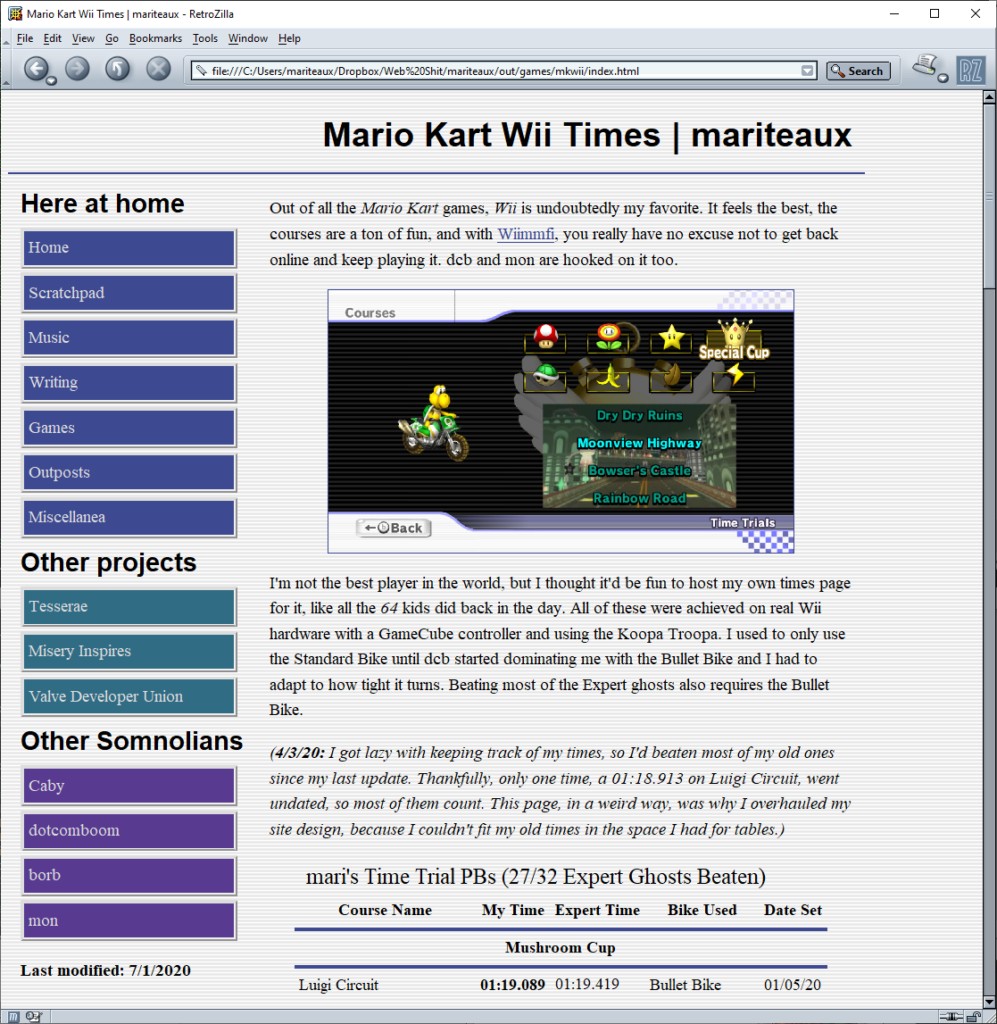
So–and this is perhaps sacrilege and certainly a 180 to some of what I used to think–I’ve redone my site to be laid out with tables instead of with Grid too, and I’ve dropped any pretense of optimizing for mobile. On phones, pinching in to zoom is practically a way of life anyway, and if you’re trying to read something, nearly all phone browsers have a reader mode built-in, whereas Retrozilla, Classilla, IE6, etc. are all utterly helpless to get anything not-janky out of a Grid layout. (I’ve also stopped forcing HTTPS, though it’s still supported–use HTTPS Everywhere if this bothers you.)
If you’re trying to do a table layout, let me give you two pieces of advice:
-
white-space: nowrap;for your sidebars, which keeps text in that cell from wrapping. Saves you some headache. -
vertical-align: top;for all cells in the table, which starts the content at the top rather than at the middle. Saves you some confusion.
There’s a couple of other older browser-friendly tweaks in here as well, namely with my fonts. I used to encode fonts in Base64 and embed them into the stylesheet to save on an unnecessary HTTP request (the font was gonna be loaded anyway!), but now, I’m back to using standalone font files, this time in three formats. WOFF2 for modern browsers, EOT for old IE, and TTF for anything else that’ll take a @font-face declaration. If your browser can’t load web fonts at all (like Retrozilla), it won’t try to, and I also have an actual, functioning font stack in there now so you’ll still get something that looks nice.

Honestly, I consider this far more worth it than mobile optimization, especially given anti-obsolescence being one of our ideals as Somnolians. The site now works in Vivaldi, Firefox, both Developer 77 and 10 ESR, Retrozilla, and Internet Explorer 6 (save for the PNG transparency weirdness that I can’t fix). Best part, it still validates as HTML5. Very pleased.
Something similar will be coming to the top-level somnolescent.net domain in a few days, though since I used more tricks there, I might need to switch some things around. I’ll also need to debug the scripts I used, they’re not too functional on old browsers for some reason. Probably relying on shit in Javascript that’s too new. Pray for me as I walk through this in Retrozilla’s debugger >_>.
