Hiding Away in the Small Web
- Posted by mariteaux on June 23rd, 2020 filed in Sperging
- Comment now »
The modern internet is miserable, and people love it. They love being exhausted and stressed and worrying about what everyone else thinks of them, they love drowning in the overflow of information, not unlike someone in a rubber suit drowning in waste water (no, I’m not sure if you should click that), and they love constantly being politicized to. It’s been a real good month for misery, and it’s been on my mind a lot.
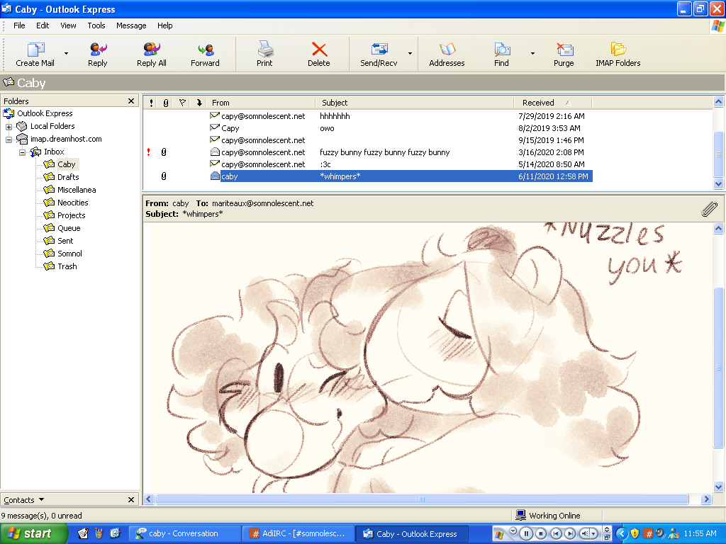
And here I am, sitting on MSN Messenger, browsing old websites, and not caring. Now, I’m a dangerous motherfucker, so yes, I take the eMachines box online all the time. Without antivirus. (As anemic the specs on this thing are, any antivirus would likely drop a Fat Man on the pagefile anyway.) I think I’ve achieved Nirvana through it, though, and with Wiby, a search engine for lightweight, static HTML sites, you can too.
Although I find the actual search engine a little lacking, Wiby’s surprise link is excellent. You’re getting a genuinely unfiltered view of a variety of usually totally hand-built sites, some fascinating, some disturbing, many still regularly updated, and thankfully fewer woke computer kids than I was expecting. (I still hit digdeeper sometimes though. Can never escape the woke menace umu.)
Here’s five utterly random ones I just found for your pleasure. Well, more than five, but five really recommended ones. Screenshots courtesy of the eMachines box and RetroZilla. I tried to keep it to ones that ran well and weren’t loaded down with ads, so sorry, Librarius and your extensive Canterbury Tales archive.
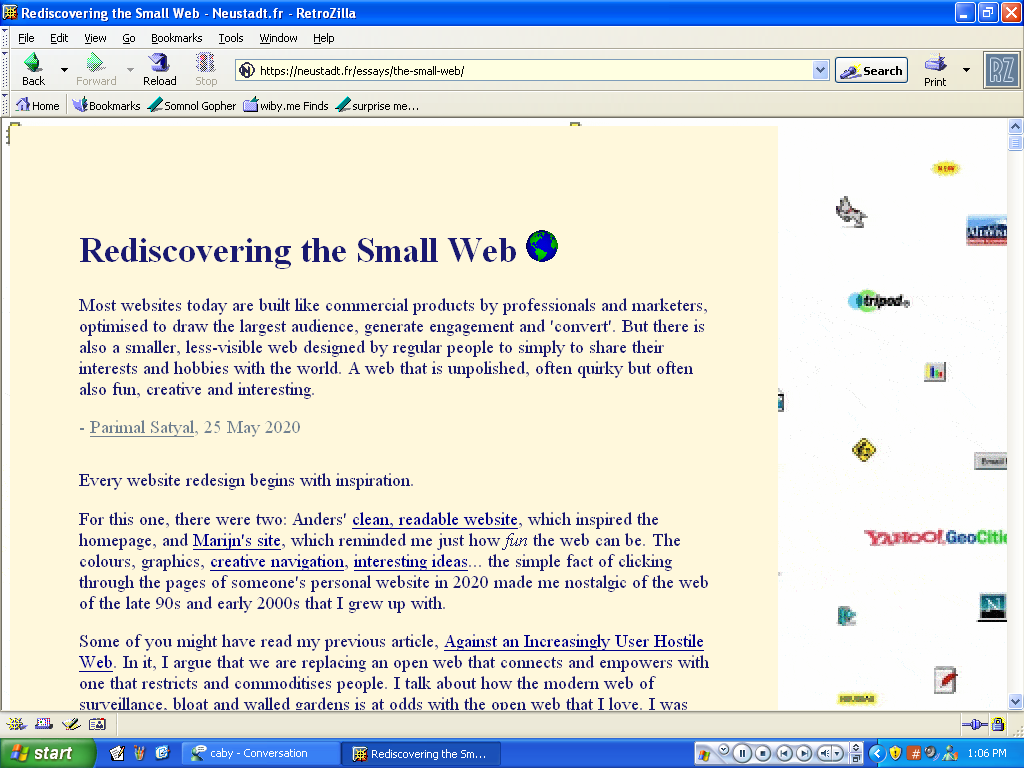
1. Parimal Satyal’s “Rediscovering the Small Web”
Let’s start off with an essay, since I deal in those a lot. This is about a UX consultant’s epiphany on how slickness has essentially neutered the internet and his attempts to claw some of the texture back. I really like this piece, since it’s just as much objectivity as it is rabid nostalgia. In fact, in spots, this sounds like something I’d write; I don’t especially share his fondness for Neocities, but that’s another rant entirely. The links to both older pages still available and still updated towards the end are also appreciated.
We all have our own little perspective on what we’ve lost, and God knows I’ve rambled way too much about it. This one’s light on the nostalgiamining. That makes it recommended reading in my book.
On a related note: Lemmy’s Land, this crazy, sprawling Koopalings fansite that got updated just today, inexplicably. It has fanfic and it has the Mario Kart Wii soundtrack. And who even knows what else. As for what this has to do with Parimal’s essay, I have no clue, but it seems to fit the spirit of it.
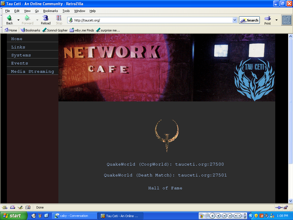
2. Tau Ceti
This one’s actually the companion site to a QuakeWorld server, but it’s got a ton of old software available for download and some internet radio to stream too.
This is part of that class of sites that run on older hardware; in this case, the FTP and Quake servers are going on an old PowerMac G3 running Panther, and that is a sexy setup. I’ll let you know how the server is when I can find a QuakeWorld client that doesn’t feel like floaty, asset replacement garbage.
On a related note: ALTEXXANET, a collection of servers for 90s internet services like newsgroups, a Gopher, and Hotline. I can’t really tell who runs this, a “platform design consultation” group? It frankly looks like a Bootstrap parody site. But hey, Gopher.
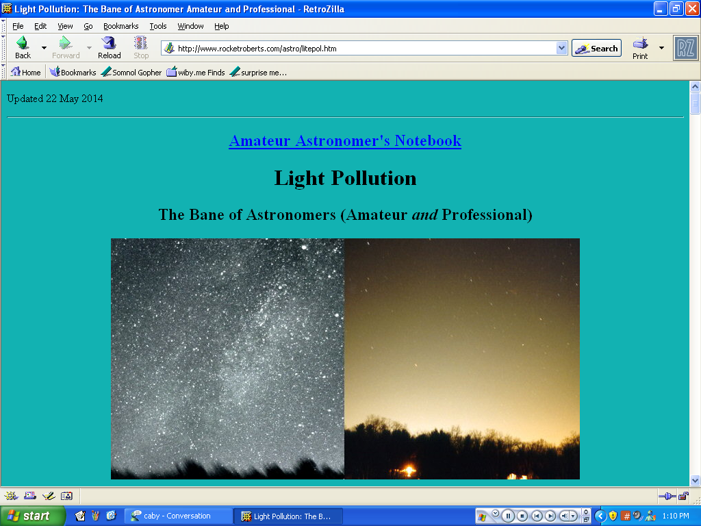
3. Rocket Roberts (specifically his page on light pollution)
Now we’re getting into the class of old sites run by hobbyists. Before people just said “fuck it” and used Facebook groups for this kinda thing, hobbyists would set up their own dedicated sites for their (often numerous) crafts that also doubled as personal home pages. This is one of those pages, a Navy engineer amateur astronomist into rockets and photography. (If you like old photos, the ones of his teenage bedroom and stereo system are finely aged. This one oughta be an album cover. God, antennas are cool.)
The page I’ve chosed to highlight is on light pollution, where the glare from outdoor lights has the ability to turn night into day. Nasty for your sleep patterns, nasty for astronomy. Light pollution is a topic that’s always fascinated me, ever since I looked out over campus one night and saw a gigantic halo, while things were pitch black across the street. Really brings that kinda thing into focus. I’m now mildly obsessed with blocking out every LED in my room and sleeping in pure darkness. It helps more than you think.
On a related note: ObservingSites.com maintains a directory across the continental US (plus Hawaii and Canada) of really good stargazing locations without much light pollution. Whether this is up-to-date, I don’t know, but hey, image maps.
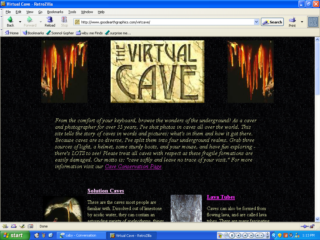
4. The Virtual Cave
You know when a retro website actually really comes in handy? That’s this site right here. As of writing this, I’ve been slowly chipping away at a story involving one of borb’s lads dinking around in a cave, and having not just the reference photos, but all the terminology is incredibly useful.
This is also one of the sites on this list that still receives periodic updates, in this one’s case, 2016. I love it when an old site never gets a redesign, really. It’s like an alternate reality where people never got internet connections faster than ISDN. Never sell out, keep your old designs. Stick it to the man.
On a related note: Tiger Minerals, all about very shiny rocks from every state across the US. Not to brag, but Pennsylvania’s got some real pretty ones. Also, last updated mid-last month and still using an image map, aw yeah. You know those are still supported in HTML5? You wokes have no excuse.
5. Carol’s Place
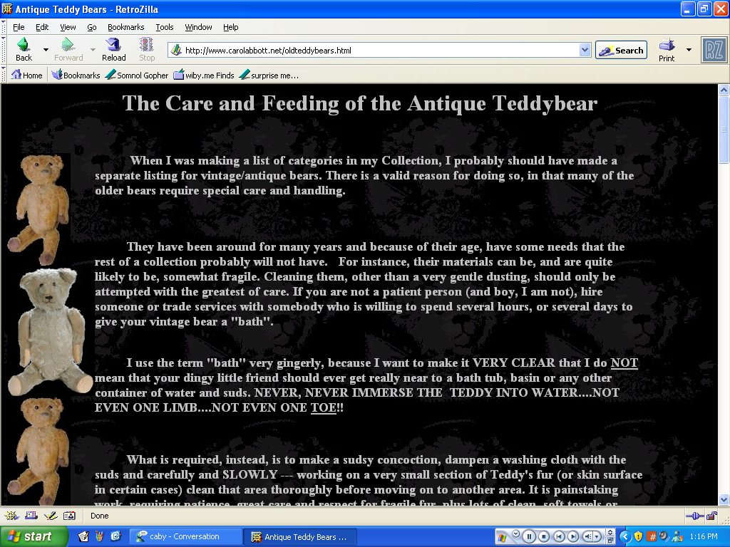
And now, I end off with what is almost certainly going to be Caby’s site in 20 years. (The teddy bear pages are proof of it.) These kinds of sites, the personal sites from older people, are always the most fascinating and detailed to browse, because you know, they actually did shit in their lives. And she writes! And it’s not bad! I have to link this because of that alone.
On a related note: If all the pink, teddies, flowers, religious stuff, and recipes strikes you as a little too grandma, Dave and Cecilia Taylor are a more…scientific pair of old folks. Astronomist geologist engineers with a ton of weather and satellite software to download. Once again, only updated a few days ago as of writing this. Seriously impressive.
No big point to make here at the end, just hope you find something curious to browse in all that. I’m basically convinced that the key to an old-looking website is to use FrontPage, judging by these pages’ sources. Another thing to add to the wishlist, I suppose…
