Postmortem on the Site Redesign
- Posted by mariteaux on March 19th, 2020 filed in Technologizing
- 1 Comment »
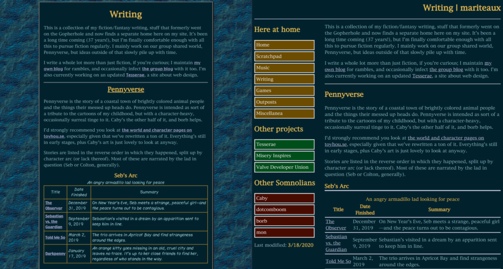
Was way too exhausted after I finished the site at 2am to update the blog about it, but for the sake of due diligence: it’s done. Came together in quite literally a day-and-a-half and I’m really happy with it. You can actually navigate the thing, it’s a little wider and more effective for it, cleaner, but still feels like my site and still feels like what inspired it. Aqua, namely. Much cleaner stylesheets and AutoSite templates too.

I avoided using grid for it like I use on a lot of my other sites because I like to make life difficult for myself. Excuse me, experiment. Jokes aside, if I built every site the exact same, it’d get kinda tired and formulaic for me. I like to branch out and use different methods and technologies, really to keep things fresh and to learn more about building sites. As a result, I built this one with flexbox. …But not intentionally.
I should explain.
Originally, I built it just using a <nav> and a <div>, both floated opposite. This worked until I needed to make a sticky sidebar work, where because the two containers were different heights, the sidebar was barely scrolling, certainly not the height of the main content. Since I couldn’t set an explicit height for one that always matched the content of the other, I went with flexbox to ensure their heights stayed equal.
I haven’t used flexbox much, believe it or not. Couldn’t get my head around it last time I tried it, which is another reason I’m as fond of grid as I am. Much simpler. Turns out, wholeass three-value flex declarations are a great way to confuse yourself. Just use initial, auto, or none if you want the child to shrink to fit, grow and shrink to fit, or neither, respectively. Alternatively, use whole numbers and mentally divide up the parent into parts. A 4 set on the sidebar and a 10 on the main content will make the sidebar 4/14th the width of the container and make the main content 10/14th the width of the container.
Clear as mud?
There seems to be a chain reaction in Somnol at the moment where everyone’s retooling and overhauling their sites, and pretty soon, my sights will be on the big one. The master somnolescent.net site. Short of it is, we were never happy with it. It really has just been placeholder after placeholder that never coalesced into feeling like the group, just me if anything. Now, that changes. Everyone’s got a say and Caby and borb are contributing banners and graphics. From our sketches, I have to say–I’m pretty hyped.
I’m sure I’ll have more to say by the end of the month. Tesserae too.

March 19th, 2020 at 1:24 pm
AutoSite hours 8)