Tesserae Tests Me
- Posted by mariteaux on December 2nd, 2019 filed in Writing
- Comment now »
In a weird spot at the moment where I’m not exactly focusing on anything huge. Really can’t, as apparently, I’ll be in Ohio for the holidays, but I haven’t heard much about that lately. I have things to do, though, so I teeter around nonetheless.
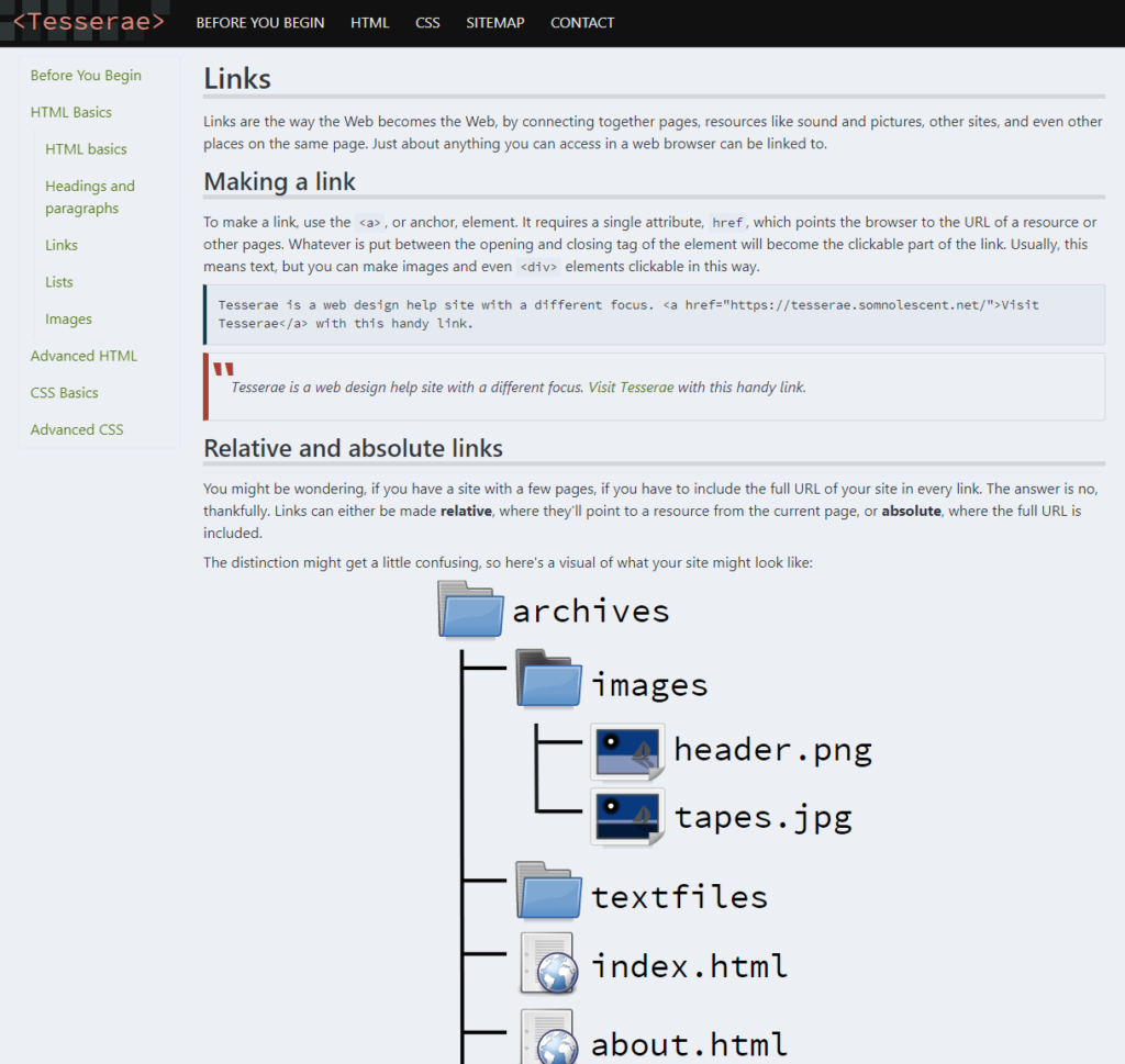
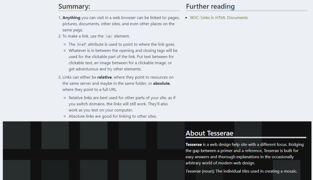
Tesserae has been my neglected little thing for the better part of this year. Errors all over it, broken, clunky design (my attempt at modernity :pensive:), and not enough visuals weighing the damn thing down, for all my efforts writing it. When I started over in September, I wanted to try a different approach to the styling, make it look truly modern, because that’s one of the goals of it: to look the part of a modern web design help site.
CSS frameworks have been a curiosity of mine ever since dcb tipped me off, so I went with one of those for Tesserae, specifically mini.css, which is funnily enough what I later used for this blog theme. It seemed speedy in my testing and the lightweightness appealed to me. Very minimal, very neutral styling that I could add the Tesserae flavor and mosaics onto.
What I wasn’t expecting was how much of a pain in the ass it’d be to use. Part of this comes down to its oddly opaque documentation: I expected to make each element the full width of the viewport on “small” screens by setting them to fluid, but it turns out, that’s all bullshit. You have to manually set the thing to take up the full width of the viewport or else everyone just gets confused. (col-sm vs col-sm-12, spot the difference.)
I couldn’t figure it out at the time, so I got frustrated and sat on it again.
Anyway, I finally fixed the issues I was having with it with the knowledge of mini.css I gained from working on this blog theme and now it’s working great, better than ever, honestly. I also spent the morning poking at two different online SVG editors (no links, they’re both shit) to try and get more graphics going on and that ended up a success too.


Who knows, might have it before the end of the next decade at this rate.
