Nostalgiamining vs Forging the Future
Let's stop with the Geocities ripoffs already, alright?
I think I've made two or three passes at this rant since I made my Neocities account, and none of them have worked. It's not that I expected the problem to go away, on the contrary. The fact that it's still here for me to bitch about after all this time is why I'm writing it now.
On May 28, 2013, Kyle Drake pushed the first Neocities blog post, the same day the site opened. Its mission statement in bold throughout: to return full control of the content and presentation back to the people producing it. Social media has traded in quirks for conformity, he cried. When we all look the same, we all fall in line. We become easier to manipulate. May 28, 2013 was the grand opening of a site predicated on making the web fun again.
Of course, those of us who possess the skill of literacy managed to work our way further down the post to find this:
In fact, the technology has made it better. We now have incredible tools for making web pages that don't look like crap, and don't randomly break on different web browsers. Now we have HTML5, which enables very powerful web sites. Like this amazing site, an interactive episode guide to the show My Little Pony, which looks fantastic and uses your browser database for storage (I dare you to make it half as good with your over-engineered, poorly scalable LAMP stack). And we have great CSS frameworks like Bootstrap and a new, even simpler one that Scott O'Hara is working on called Ground Floor, that makes web sites look pretty good even if the designer doesn't use or understand CSS at all.
This part of Kyle Drake's uniting vision seems to fallen on deaf ears. It's an epidemic around here, and I'm giving it a name in the hopes that maybe we can get some of you uncreative fucks to do something about it. Let's talk about nostalgiamining.
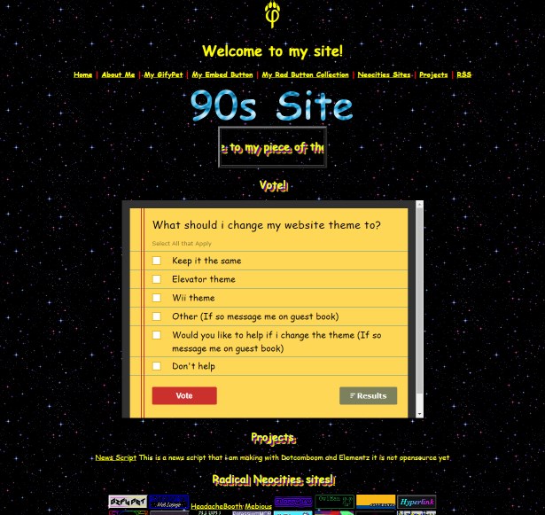
Nostalgiamining refers to the cherry-picking of arbitrarily defined "retro" elements in an attempt at revivalism. Rather than do anything unique with or make some kind of commentary about these elements, nostalgiaminers haphazardly stick shit together in an attempt to be charming or to mask a complete lack of creativity. This can affect any medium, but it's rampant on Neocities.
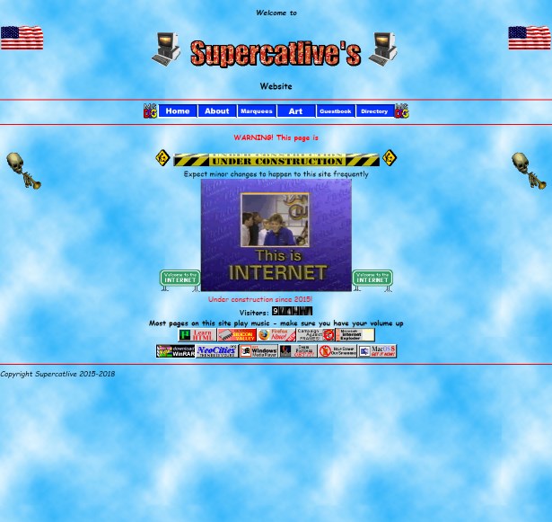
Nostalgiamining on Neocities usually manifests in loud, sometimes moving backgrounds (stars are popular), hard-to-read color schemes (or outright fucking rainbow text), walls of 88x31 buttons, guestbooks, deprecated tags, autoplaying MIDIs, and blinking shit. In short, it's being a fucking spastic in web form and calling it retro and cool, because Neocities is like the new Geocities, right?
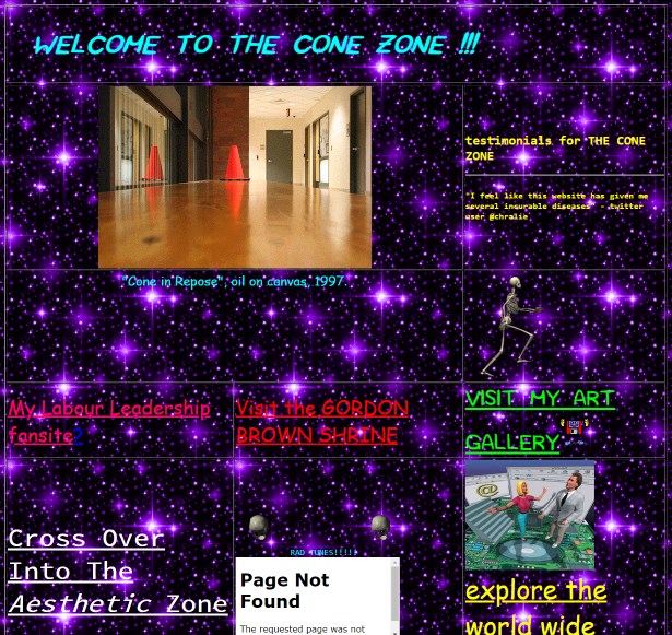
It's not hard at all to find these sites.
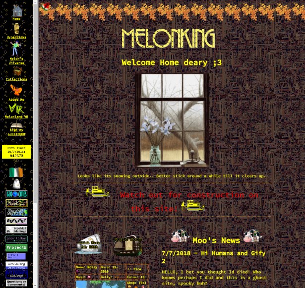
You might be asking yourself, you know, what's the big deal, right? It's their site, they can do what they want, no big deal, right? The problem is ultimately that this shit makes the rest of the site look like a joke (as if it wasn't to start with). New users will come to a site like Melonking's, see frames, tons of obnoxious animated GIFs, and think this is all Neocities is about. Neocities is one of the best ideas I've seen on the internet so far, and people here are content to wallow about in sad imitations of the worst ideas in the history of web design.
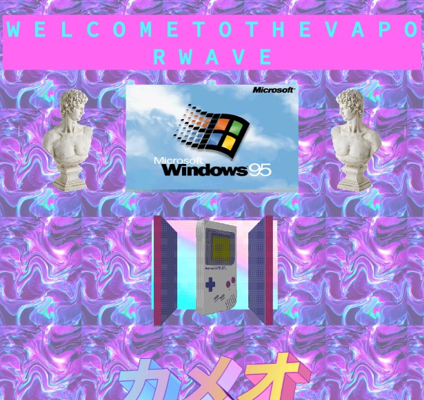
While it's true that annoying, loud GIFs, bad color schemes, completely non-functional layouts, and cheese ran wild on Geocities, not every site was like this. Sites that were largely static, made good use of the limited web-safe palette, and navigate well still largely hold up today. In a sense, nostalgiamining is stereotyping the 90s web, and that's what we're copying, because it's retro and cool.
If you do happen to have a site because you have something to share rather than just having a site to have a site, why not present it in a unique way? HTML and CSS provide limitless opportunities for sites to get creative with the way they unfurl for the reader, and you're here with a frame, some construction GIFs, and a MIDI in the back.
What the fuck is wrong with you?
Something else that gets right up my ass about nostalgiamining is the fact that rarely is it used to present anything of value. Geocities had some real eyesores, but for things like fansites? Homegrown writing, fresh from Wordpad? Collections of mods and WADs, lovingly handpicked? I can give it a pass. Those were passion projects.
The only thing on your shitty, sad site is how much you love Linux, and links to all the webrings you're a part of. You're not writing about actually interesting, engaging things that I might not know about. You're not exposing me to anything new. You're just jerking off.
Let me make it clear that, if you have an animated GIF or a few on your site, if you like buttons, if you're not the best at HTML—I'm not necessarily saying there's anything wrong with your site. It's the mindset that counts. If you're here to have a "cool, retro Geocities site", you're a degenerate. If a hard drive crash hit your site tomorrow, nothing of value would be lost.
I also don't think the polar opposite (sites with no styling, no images, no movement) is necessarily better either. It's a balancing act. I like seeing a site that's a little weird, a little off-kilter. Some wonky colors won't kill anyone, myself included. There are elements of the old Geocities that I honestly do not mind. Again, mindset counts. Take a risk.
I'd simply like to see some of you drop the act, come up with a unique look, and write about some things you're actually passionate about, instead of doing the same "I LOVE TO CODE IN HTML" shtick as everyone else.
And hey, so this rant isn't all bad, I'll rattle off five Neocities sites I think are doing something unique and cool around here. No, they're not shiny and professional. They all get my seal of approval though, so if you're looking for what I actually like in a Neocities site, here's a list:
1. Arkm's World
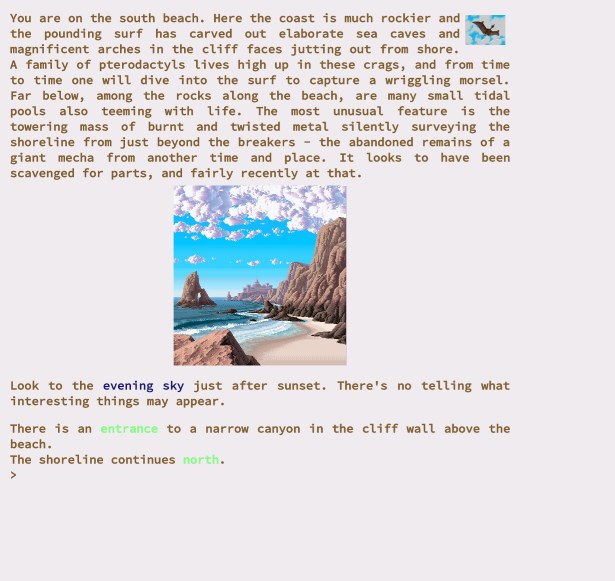
I was enthralled by Arkm's site the moment I saw it. It's an absolute maze of interesting and unique locations text-adventure style, and you can explore at your leisure. Helps that Arkm is a really good writer too. Sure, there's some lists of links scattered about to find, but that's ultimately not what you're there for. It's the journey that counts, and I've seen not a single site quite like it.
2. Btnsmshr
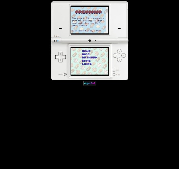
This one's just awesome. The site's presented like a DS game, complete with clicking on the touch screen to get around. It's a really unique way to present things, and it's even got some secrets, which are always fun. In the same vein, obe's site, which is based off a Game Boy Micro.
3. elementz
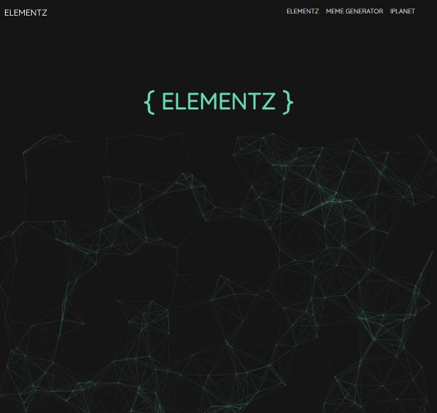
I'm day-to-day with elementz, ultimately, but his site definitely sticks out for looking shinier and more modern than anyone else's. While everyone else is grabbing pickaxes, elementz is keeping up with actually modern web design, and it's pretty slick. It's also much less a personal site and more a playground for whatever shit he happens to be working on this week, which I can commend.
4. edlinfan
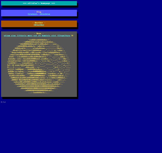
I appreciate the text-mode look, even if it's not a site I frequent. DOS nostalgia is hot. (If someone can tell me what area the weather section actually pertains to, I'd love to know.)
5. Rainstorms in July
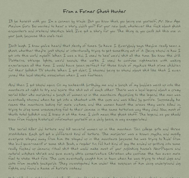
"But what if I'm totally uncreative?" you might ask. Do what Rainstorms in July does and strip that shit down to the studs. This totally minimalist approach works really well if you're an interesting person, or you make interesting things. Make that the focus and your site will speak for itself.
I wanna mention gwtagacw's site as well. I didn't include her as one of my five because she's already one of the most popular people on this site, but her hand-drawn images and strict CGA color scheme look sharp as hell. Simple, but effective. If you have a hard time with color schemes, go grab a Super Game Boy palette you like and use its colors instead. And hey, that's retro too.
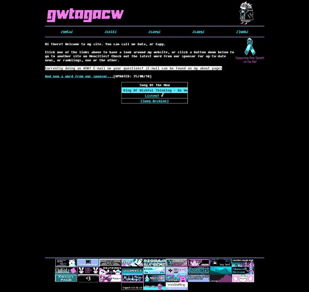
Get creative with it, kids. Forge the future.
< Back to index