2018
Jesus cock-sucking christ was this year difficult. I churned out so much art this year and a lot of it was really fucking good so trying to trim the fat to make the length of this more bareable was damn near impossible. I did my best to squish it down and I'll be trying to make this easier to read through by being an obnoxious moron, I promise.
Anyway, did someone say sparkledogs? Yeah, it didn't get much better this year. There was a much bigger range in types of characters I drew, though. You've got all sorts of colorful faces here and most of them aren't mine because I went down a dark road of adoptable obsession around this time. u_u
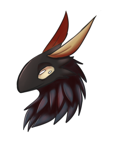
My shading gets really shiny this year. You guys aren't ready. Anyway, this is a gift I drew of a character I also technically helped design? I still think it looks good. I just wish it wasn't so stupidly pointy for no reason.
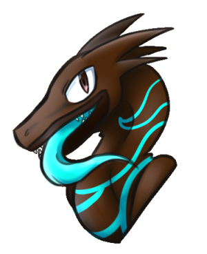
This year is also the year where my style starts to look a bit Pokemon? I didn't have an issue with that then and I don't have one now. Also, no. No I still haven't found a lining brush I'm satisified with yet. :(

Man, that face... Definitely a solid angry face. I used my rather ugly sketching brush to line this one to give it a less structured feel I guess? I'm really not sure if that worked out in the end, but good on me for getting creative.

I wanted to draw a neat little pixelated dinosaur diorama thing and then decided to base it on a meme. As of writing this, this is my top favorited post on DeviantArt. Please save me from myself. u_u
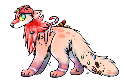
I still think this art of a candy dog has aged really well. It has solid anatomy, the head isn't too big, it's aged like a fine fucking wine. Don't do try that with actual candy though. I can't guarantee the same results will feel good on your stomach.
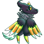
I tried to apply my normal shading style to pixels and I don't actually think it looks that bad. Maybe with some more refining it'd work pretty swimmingly.
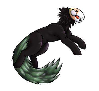
Man, I really overdid it on the shines here especially. It's made the leafy tail here look almost soggy. The rest of it still holds up decently well, though. Especially the shading on the neck fluff.
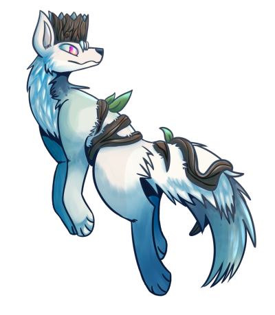
I was trying to think of tree puns, but I couldn't reach the branches. This pose is really weird btw. That's important for me to state.
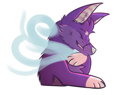
Now THAT'S a Surprise! I'm still proud of this! I'm not proud of the outline at all, but I'm very proud of the overall look of this. I feel like it's a good visual representation of his personality.

Why did I have to switch to blue shading for the head? This could've looked perfect! Instead what we have is a jarring contrast of colors and tones. I still use the wrappings here as a reference sometimes because I'm that proud of how they look though. I use them as an example for myself almost for shading.
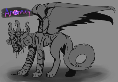
This character had so many details to draw just for this sketch and I felt so accomplished doing it that I kinda have to put it here. It was a nightmare, but it made me feel fucking powerful

Before you ask, I actually did the tilted look on purpose for effect! It added an extra bit to a piece that was planned to look rather forebodding and mysterious. I wanted to give the impression of something shrouded in darkness, but visible and watching.